
")


If you have a podcast, blog, or long form piece of content and you are still only posting some version of “new episode out now,” you are leaving a lot on the table.
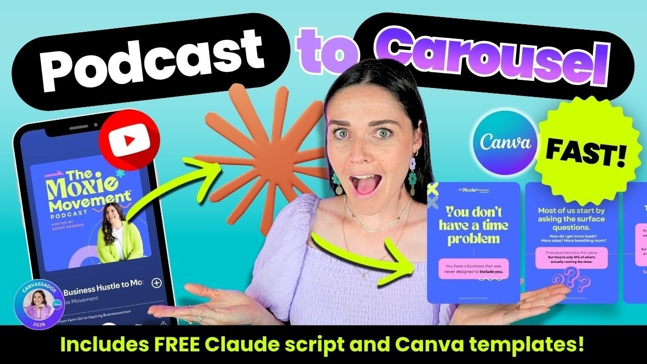
A strong podcast episode can become a full Instagram carousel, and it does not have to take hours. With a transcript, a reusable Canva template, and a simple AI prompt, you can turn one episode into a polished branded post in about 15 minutes.
This workflow is part of a bigger content repurposing system. The point is not to churn out random extra posts. The point is to pull more value from the thought leadership you have already created and turn it into content your audience will actually stop and read.
Table of Contents
- Step 1: Start with the transcript
- Step 2: Use AI to turn the transcript into carousel copy
- Step 3: Open a reusable Canva carousel template
- Step 4: Paste in the content before you fuss over the design
- Step 5: Adjust the layout to suit the copy
- Step 6: Trim extra pages and keep only what serves the story
- Step 7: Pull in the brand guide
- Step 8: Apply brand colors across the whole carousel
- Step 9: Change the fonts, but protect readability
- Step 10: Remove stylistic details that do not fit the brand
- Step 11: Update repeated text across all slides in one go
- Step 12: Add a logo or podcast identifier without stealing attention
- Step 13: Add brand elements for recognisability
- Step 14: Support the message with relevant visuals
- Step 15: Vary the layouts so the carousel does not feel repetitive
- Step 16: Bring in a photo when it adds interest
- Step 17: Use cross slide continuity for extra polish
- Step 18: Build a strong final call to action slide
- Step 19: Save the finished carousel back into your wider content system
- Step 20: Keep the real goal in mind
Step 1: Start with the transcript
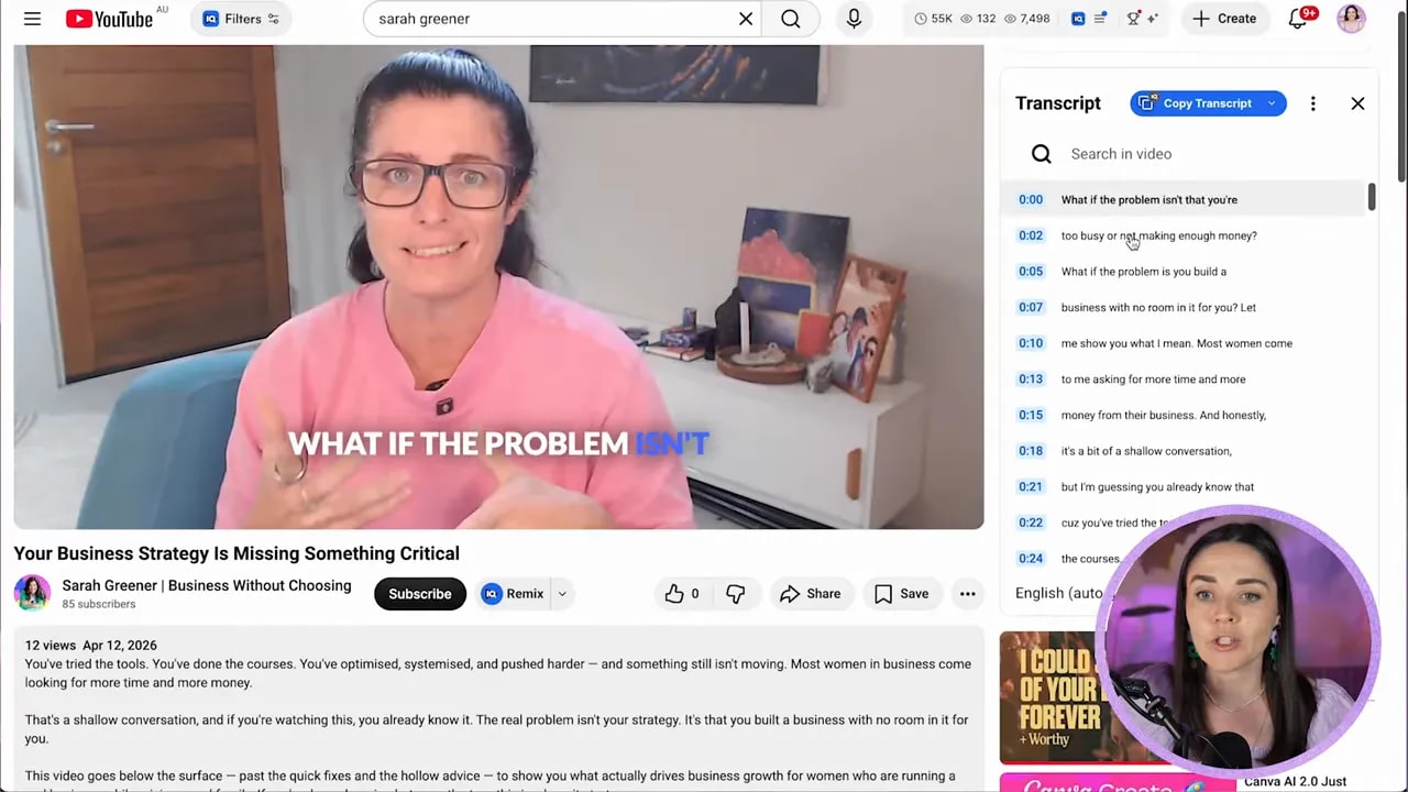
Your first job is simple. Get the spoken content into written form.
If your episode is already on YouTube, you can usually grab the transcript directly there. Open the video, expand the description area, and look for the transcript option. Once it is visible, copy the full text.
If your content is not on YouTube, use whatever transcription tool you already have access to. The tool is less important than the output. What you need is a clean block of written words you can work from.
The goal here is not perfection. It is speed and access. You are turning spoken ideas into editable copy.
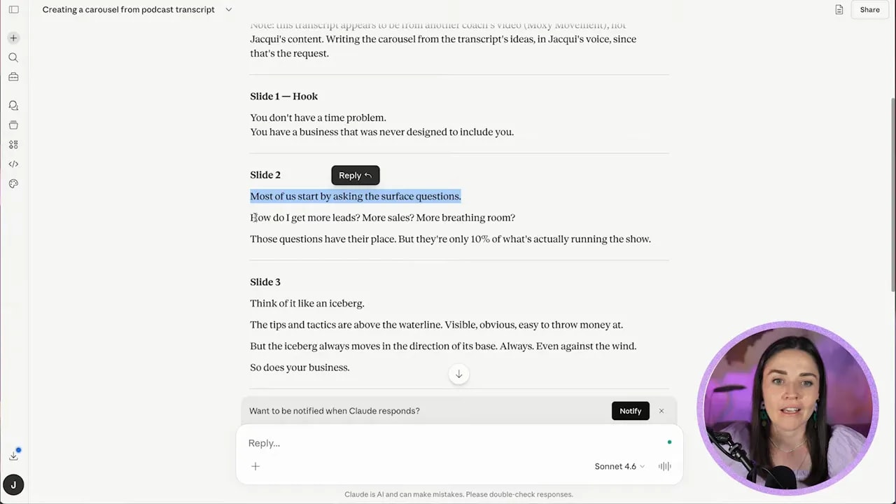
Step 2: Use AI to turn the transcript into carousel copy
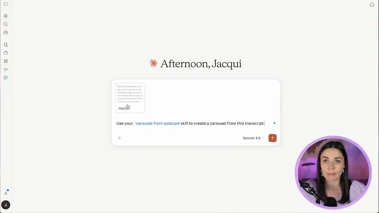
Once you have the transcript, drop it into Claude or your preferred AI tool.
The clever part here is using a repeatable prompt or skill rather than starting from scratch each time. Instead of asking AI vaguely to “make a carousel,” teach it the kind of output you want. That means a clear hook, slide by slide copy, and a structure that works for social posts.
In Claude, this can be done with a custom skill. The idea is that you preload instructions for how a podcast episode should be transformed into carousel text, then paste in the transcript and let the tool do the first pass for you.
If you want the exact Claude skill used in this process, you can download it here: podcast to carousel Claude skill.
Your prompt can be very simple once the skill exists. Something along the lines of:
- Use the carousel from podcast skill
- Create a carousel from this episode
- Paste the transcript underneath
Then let it generate the draft copy for each slide.
Step 3: Open a reusable Canva carousel template
Do not design from a blank page every week. That is how content repurposing turns into a giant time sink.
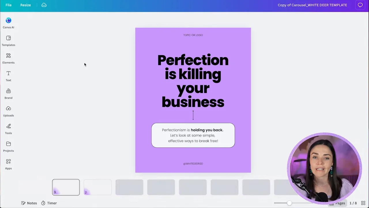
Instead, open a prebuilt carousel template in Canva. This gives you a base structure with cover slide, content slides, and a call to action slide already laid out.
A reusable template matters because it removes decision fatigue. You are not figuring out the framework every time. You are simply swapping in fresh content and then styling it to suit the brand.
If you want Canva templates like the one used here, you can grab them here: Canva templates.
Step 4: Paste in the content before you fuss over the design
This is one of the biggest time savers in the whole process.
Take the AI generated copy and paste it into the template first. Do not waste time perfecting fonts, spacing, colors, or decorative elements before the real content is in place.
Why? Because the design will always need to shift depending on the length and shape of the copy. If you style first and paste later, you end up rehandling everything.
So begin by:
- Pasting your hook into slide one
- Pasting your supporting text into the body box
- Moving slide by slide through the draft
- Ignoring fine tuning until the full message is in place
In the example workflow, the opening hook became “You don’t have a time problem,” followed by a stronger supporting statement underneath. That gave the cover slide a bold, scroll stopping message right away.
On later slides, some copy needed to be split across multiple text boxes to create hierarchy. That is normal. Templates are starting points, not rigid rules.
Step 5: Adjust the layout to suit the copy
This is where design knowledge matters more than template dependence.
As you paste the text in, some slides will need extra breathing room, some will need fewer elements, and some will need the message broken into chunks so it is easier to read.
Look for hierarchy first:
- What is the main takeaway on the slide?
- What should be large and bold?
- What should sit smaller underneath as supporting detail?
- What can be removed because it is competing for attention?
For example, if a slide starts with a key thought and then expands on it, keep the headline large and let the secondary text sit beneath it in a smaller size. That keeps the reader’s eye moving in the right order.
Also, if a certain template page already matches the structure you need, duplicate that page instead of rebuilding the same edits over and over. This is especially helpful once you have removed unwanted labels or decorative placeholders.
Step 6: Trim extra pages and keep only what serves the story
Once the full draft is placed into Canva, step back and see what you actually need.
You might have spare template pages, duplicate layouts, or slides that no longer fit the final structure. Delete them.
A good carousel feels intentional. Every slide should earn its place.
If you need to bulk select pages in Canva, turn on page thumbnails if they are not visible, then shift select multiple pages and delete them in one go. That keeps the deck tidy quickly.
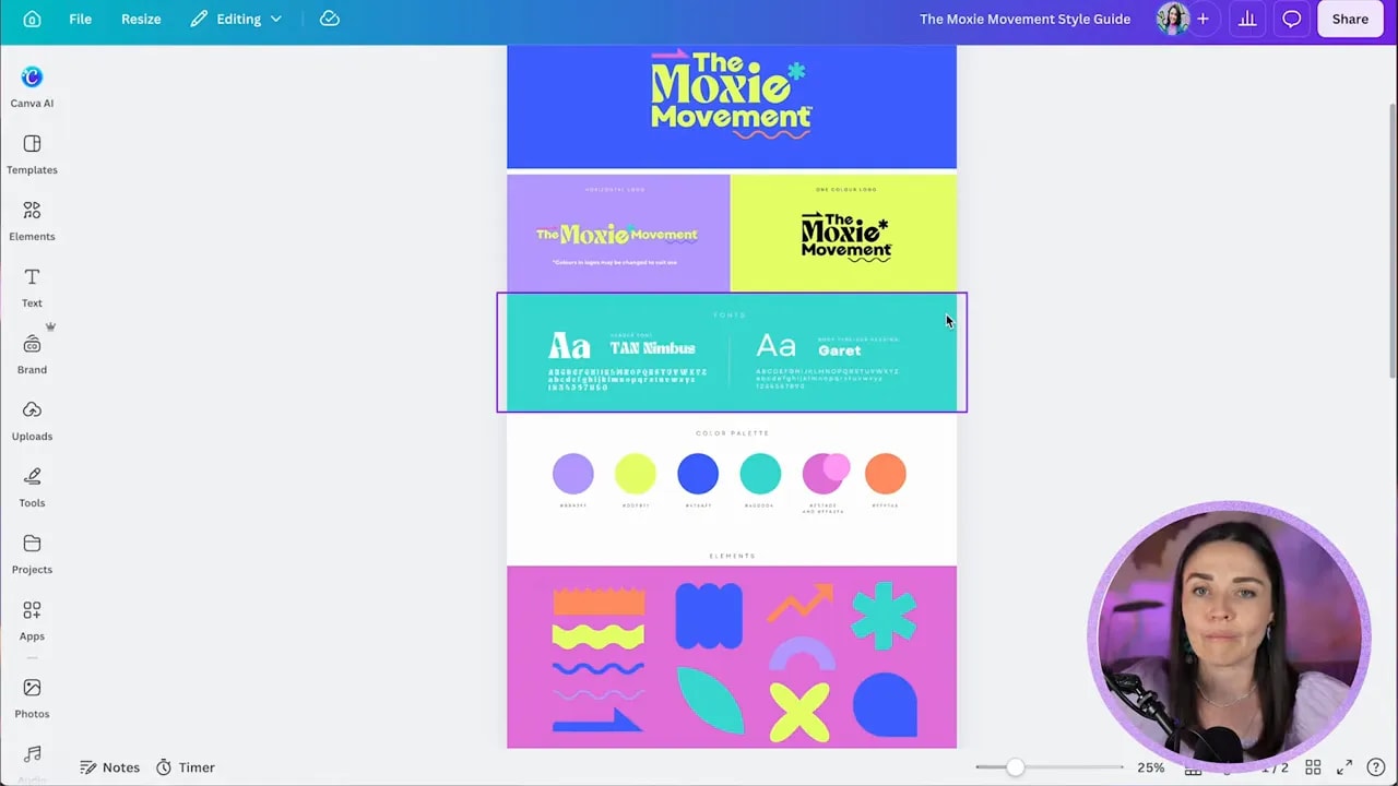
Step 7: Pull in the brand guide
Once the words are in, now you can make it look like the brand it belongs to.
If you already have a Canva brand kit set up, brilliant. Use it. If not, refer to a style guide and manually bring in the key ingredients:
- Brand colors
- Primary and secondary fonts
- Logo variations
- Supporting elements or patterns
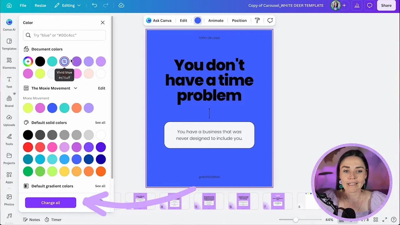
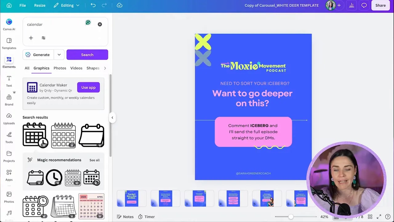
In this example, the client’s brand was bold, playful, and punchy. So the cover slide shifted from a generic purple base to a vivid blue background pulled from the brand palette.
An easy trick inside Canva is to paste brand colors onto a spare page so you can quickly sample them throughout the design.
Step 8: Apply brand colors across the whole carousel
Once your colors are available, update the template background and recurring shapes first.
If Canva offers to change all matching colors throughout the design, take advantage of that. One click updates repeated backgrounds and saves you from doing the same task slide by slide.
Then refine the rest:
- Choose one dominant background color
- Use a contrasting highlight color for headline moments
- Use a secondary accent for boxes, lines, or callouts
- Keep the palette tight so the carousel feels cohesive
In the sample design, the combination of blue, yellow, and pink gave the carousel a lively, on brand feel without becoming chaotic.
Step 9: Change the fonts, but protect readability
Brand fonts can instantly transform a post, but they still need to function.
If your brand has a decorative display font, use it with restraint. It can work beautifully for short hooks or titles, but if you overuse it, the design gets noisy very quickly.
That is exactly why readability has to stay the priority.
As you test the font:
- Increase line spacing if letters feel crowded
- Reduce the text size if it is pushing too close to the edges
- Switch supporting paragraphs to a cleaner font if needed
- Watch for color clashes that make the text harder to read
The best branded design is not the one that uses the brand assets the most. It is the one that makes the message easiest to absorb while still feeling recognisable.
Step 10: Remove stylistic details that do not fit the brand
Templates often come with outlines, borders, strokes, shadows, or other decorative bits that may not belong in your brand world.
Be ruthless here.
If your brand does not typically use black outlines, remove them. If a box shape feels too heavy, soften it. If a line is distracting, recolor it or simplify it.
FREE Design Tools to $100k Masterclass
Grow your biz with clever design and Canva hacks that will save you hours and make you sales.
The faster way to make a template look custom is not always by adding more. It is often by stripping back whatever feels off brand.
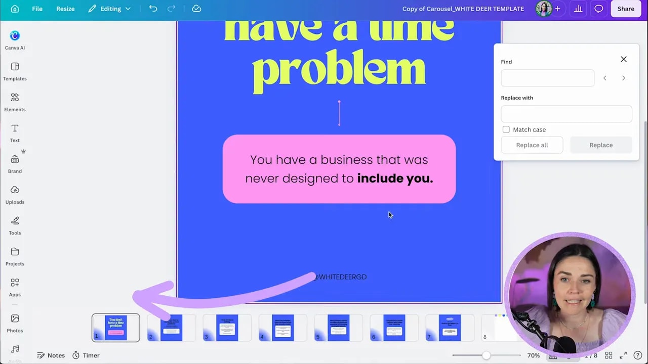
Step 11: Update repeated text across all slides in one go
One of the handiest Canva features in this whole workflow is Find and Replace.
If your template has the same handle, label, or footer repeated across multiple slides, do not update each one manually. Use Canva’s text find and replace tool and swap them all at once.
This is perfect for things like:
- Instagram handles
- Podcast titles
- Repeated calls to action
- Footer labels
Go to the file menu, choose find and replace text, enter the original text, then replace it with the correct branded wording.
Step 12: Add a logo or podcast identifier without stealing attention
Your branding should be clear, but it should not shout over the message.
Add the podcast logo or name near the top of the slides in a way that supports the design rather than competing with the headline. If the exact logo variation is not available, use what you have and adapt it carefully.
The trick is scale and placement. Small and intentional usually beats large and loud.
Then copy that element across the slides once you are happy with it so the deck keeps a consistent system.
Step 13: Add brand elements for recognisability
Once the foundations are working, you can bring in supporting brand elements like patterns, icons, abstract shapes, or small graphic flourishes.
The goal here is not decoration for decoration’s sake. It is recognisability.
A few subtle, repeated visual elements can make the carousel feel unmistakably yours. Just do not overbusy it.
Think in terms of small touches:
- A shape tucked into a corner
- A repeating pattern faded into the side
- A distinctive mark or motif from the brand system
- A connecting line that runs through the carousel
These little pieces help the design feel polished and consistent across slides.
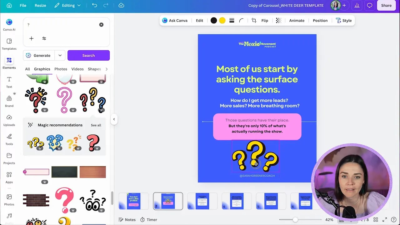
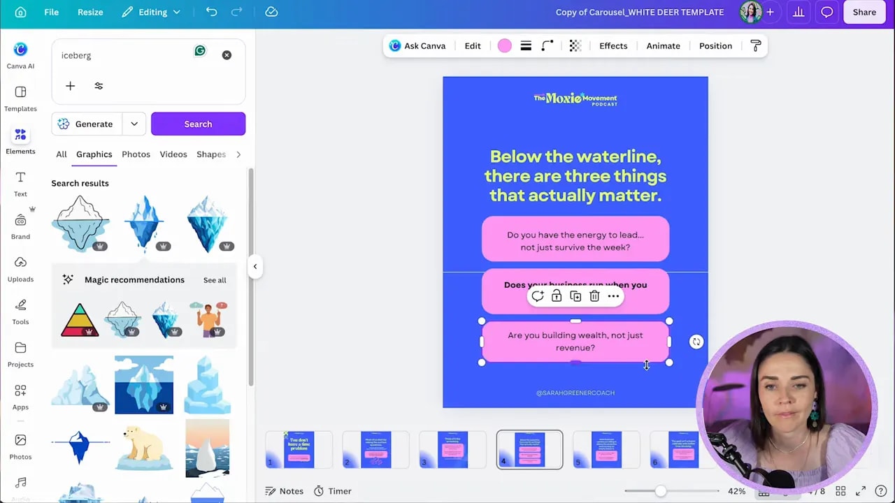
Step 14: Support the message with relevant visuals
If a slide suggests a clear visual metaphor, use it.
One example in this carousel was the idea of an iceberg. That naturally lends itself to imagery which helps reinforce the point. Another slide focused on questions, so a subtle question mark element was added to give the concept a visual anchor.
When adding visuals:
- Choose elements that suit the existing brand style
- Keep them subtle if the text is doing the heavy lifting
- Connect them to the layout rather than floating them randomly
- Use opacity or layering if you want a background texture effect
A good visual should feel like it belongs to the idea, not like it was forced in because the slide felt empty.
Step 15: Vary the layouts so the carousel does not feel repetitive
You want consistency, but not sameness.
If every slide uses the exact same composition, the carousel can start to feel flat. A better approach is to work within a system while allowing for some variation.
That might mean:
- One slide uses a large headline and one box
- Another splits a concept into three stacked boxes
- Another introduces a photo
- Another uses a more open layout for contrast
The sample carousel used this especially well on the slide explaining that there were three things below the waterline that mattered most. Instead of leaving that idea in one paragraph, it was broken into three separate boxes so the structure was immediately visible.
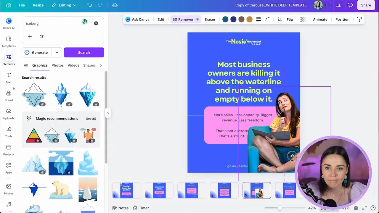
Step 16: Bring in a photo when it adds interest
Photos can break up text heavy slides beautifully, especially if the carousel is built around a personal brand or podcast host.
If you are a Canva Pro user, background remover makes this very quick. Drop in the image, remove the background, resize it, and place it so it interacts nicely with the text rather than blocking it.
Good placement matters. In the sample design, the cutout image was positioned so the text wrapped around it and the whole slide felt more dynamic.
This works particularly well on slides where you want a little more personality or where the content needs a visual pause.
Step 17: Use cross slide continuity for extra polish
If you want the carousel to feel more sophisticated, you can extend a visual element across two slides so it looks like it is moving from one page to the next.
This might be part of a photo, a shape, or a box placed right at the edge of one slide and then continued into the next.
It is a small detail, but it adds a lot of polish and movement.
The process is basically:
- Place the element near the edge of one slide
- Copy it
- Paste it onto the next slide
- Shift it into position so it continues naturally
You do not need to do this everywhere. One or two transitions are enough to make the carousel feel more intentional.
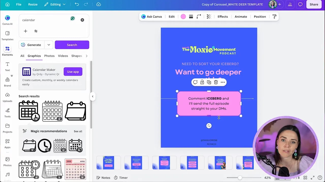
Step 18: Build a strong final call to action slide
Your last slide should not just peter out. It should tell people what to do next.
That might be:
- Listen to the full podcast episode
- Comment a keyword for a resource
- Visit your website
- Go deeper on the topic
The stronger and more specific the call to action, the better.
In the example carousel, the final slide invited people to engage with a keyword related to the iceberg theme. That made the CTA feel tied to the content rather than generic.
Step 19: Save the finished carousel back into your wider content system
This part is easy to overlook, but it is what makes the workflow scalable.
Once the carousel is done, add it back into your broader content production system so it becomes a reusable asset, not a one off project.
That might look like:
- A Canva file that houses all assets for each episode
- A spreadsheet tracking your repurposed content pieces
- A bank of reusable layouts your team can duplicate weekly
- A documented process for turning one podcast into many outputs
This is where the real magic is. The carousel itself is useful, but the repeatable system is what gives you consistent output without reinventing the wheel.
Step 20: Keep the real goal in mind
The point of all this is not to get lost inside Canva or spend forever tweaking tiny details.
The point is to create a simple system where your long form content gets shared further, more often, and in a way that still feels beautifully branded.
With the right setup, this becomes a quick repeatable task:
- Grab the transcript
- Generate the copy with AI
- Paste into your template
- Apply the brand
- Swap in relevant visuals
- Publish
That is how one podcast episode becomes far more than one podcast episode.
If you want to see the bigger system behind this approach, including how it fits into a full content engine, you can explore the Hero Design Masterclass.
If you want to browse the client brand used in this example, you can also visit The Moxie Movement.
A good brand plus a good system plus good content is an incredibly powerful combination. Once you have those three working together, repurposing stops feeling heavy and starts feeling obvious.


