
")


Want simple, repeatable design moves that turn DIY graphics into polished, professional visuals? These are four practical design steps pros use all the time—plus the one rookie mistake that instantly gives away a “DIY” design and how to fix it. Use these in Canva or any basic design tool.
Table of Contents
- Step 1: Use all caps with lowercase to create clear text contrast
- Step 2: Add subtle shadows to create depth
- Step 3: Break center alignment—use asymmetry and balance
- Step 4: Layer elements to increase visual interest
- Step 5: Fix the biggest amateur giveaway—too many fonts
Step 1: Use all caps with lowercase to create clear text contrast
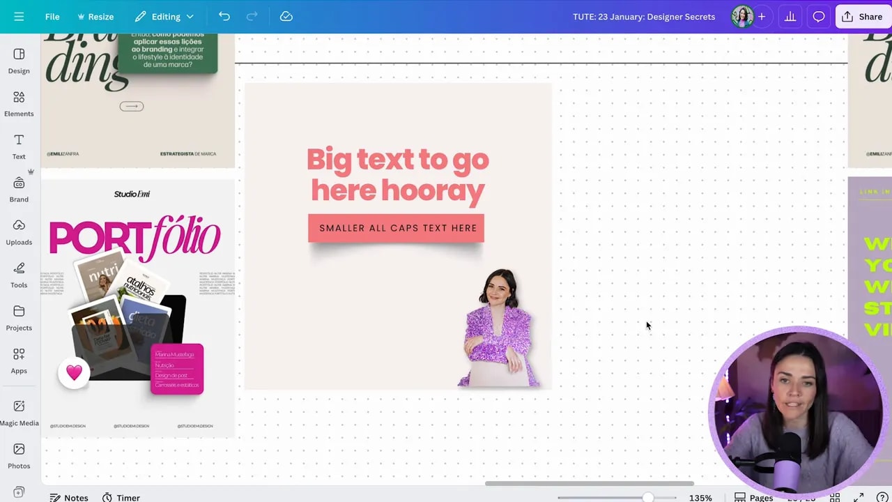
Pairing small uppercase text with larger sentence case or title case text is a classic professional move. The trick is contrast in size and weight—not shouting the whole sentence in capitals. That contrast creates a hierarchy and makes designs feel intentional.
Practical Canva tips:
- Press T to add text quickly.
- Toggle uppercase instead of retyping—Canva has an uppercase option so you can switch back if needed.
- Pair a bold headline with a thin, spaced uppercase label underneath for a modern, airy look.
- Limit all caps to short bits of text—aim for 3–5 words max, and never use it for long paragraphs.
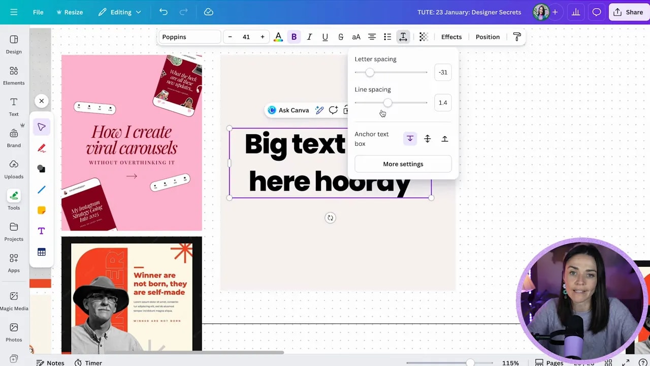
- Use letter spacing (advanced text settings) to create an open, premium feel for small uppercase labels.
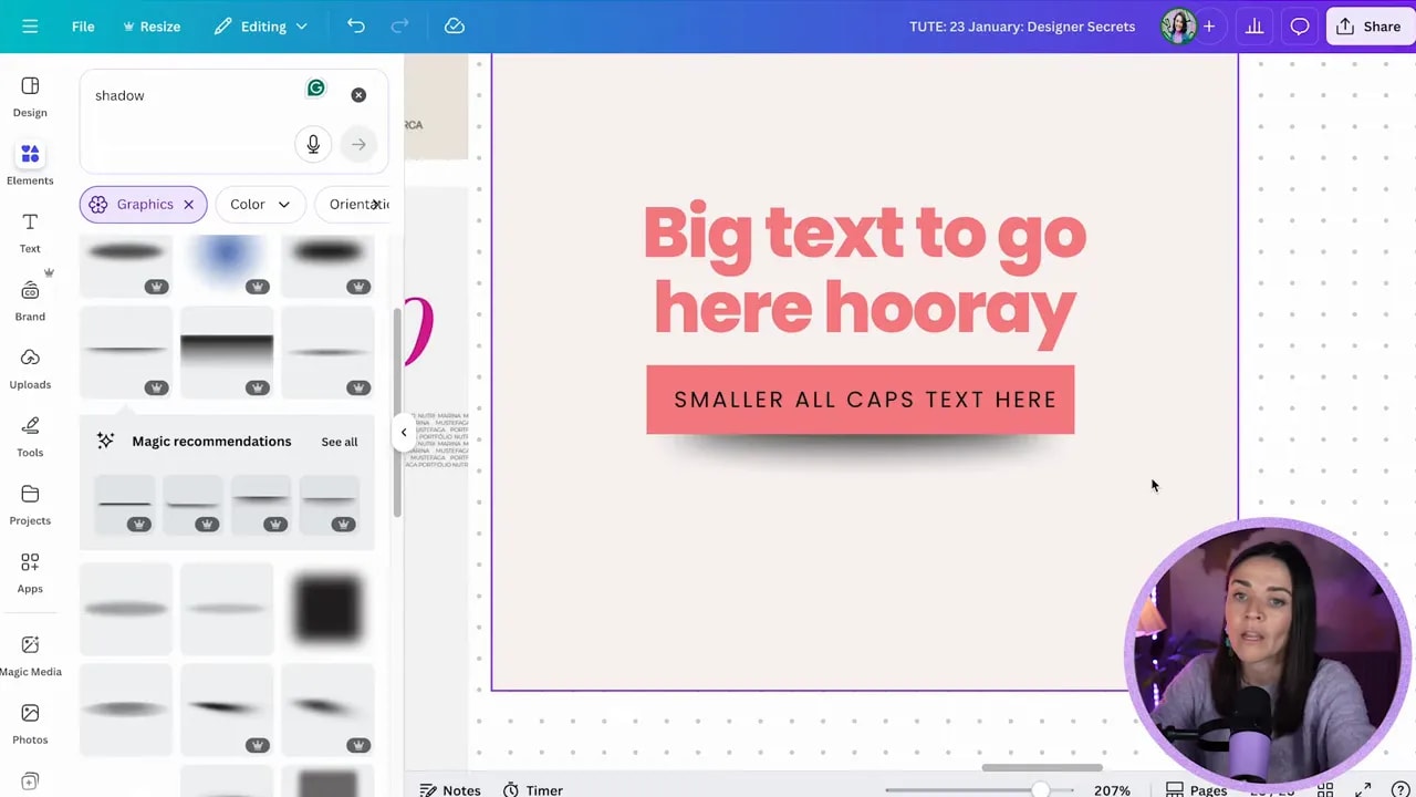
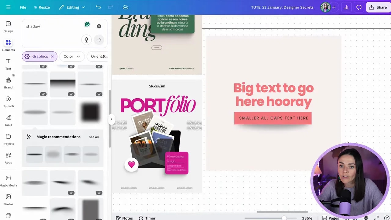
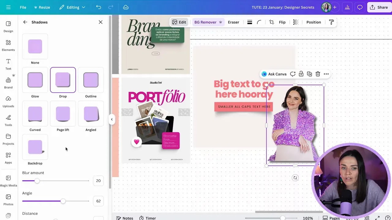
Step 2: Add subtle shadows to create depth
Shadows are a low-effort, high-return trick. A soft, subtle shadow under a box, behind a mockup, or under a cutout photo gives depth and makes elements feel tangible. The key word is subtle.
How to shadow like a pro in Canva:
- Search Elements → “shadow” to find shape-based shadows (rectangular, circular, curved, leaf, etc.).
- For boxed elements, try a cutout shadow aligned under the shape, then reduce transparency to around 30%–40%.
- To make things feel like they are floating, use a small blurred shadow slightly offset from the object.
- For images, use Edit → Shadows → Drop shadow and then increase blur and lower intensity so it reads as depth rather than a harsh border.
- If the shadow becomes visually dominant, lower the opacity. If you notice it first, it’s too strong.
Step 3: Break center alignment—use asymmetry and balance
Centering everything is safe, but it can look predictable. Professional layouts often use asymmetry: text left, image right; large headline on one side and small supporting text on the other; or intentionally empty space balanced by a heavy color block.
FREE Design Tools to $100k Masterclass |
|
Grow your biz with clever design and Canva hacks that will save you hours and make you sales. |
| Get My Free Ticket |
How to do this without breaking your composition:
- Decide what the main focal point is, then move secondary elements off-center to create tension and movement.
- Keep balance by using contrasting weight (color blocks, size, or image density) on the opposite side.
- Avoid angling things just for the sake of it. If you angle, make sure there’s a reason—visual flow, emphasis, or brand style.
- If this feels advanced, start by nudging one element left or right rather than rotating everything.
Step 4: Layer elements to increase visual interest
Layering means stacking boxes, images, text, and small doodles to make a composition feel rich and intentional. When layers are used well they guide the eye and connect focal points. When used poorly they create confusion—so layer with purpose.
Layering tips:
- Keep your main focal point dominant. Smaller layered elements should support, not compete with, that focal point.
- Use position/arrange or keyboard shortcuts (Cmd/Ctrl + [ or ]) to move elements through layers quickly.
- Overlap slightly to connect elements. Tiny overlaps help the eye travel from one item to the next.
- Use color, shadow, and scale to separate layers and keep text readable.
Step 5: Fix the biggest amateur giveaway—too many fonts
Using too many fonts brings in competing personalities and creates visual noise. A design that looks unpolished often has 4 or 5 different typefaces fighting for attention.
Simple rule:
- Use a maximum of two to three fonts. Usually one for headings, one for body, and optionally a small accent font.
- Choose fonts that contrast: a strong display or bold sans for headlines with a readable serif or simple sans for body text.
- Avoid combining multiple decorative or highly stylized fonts together.
Quick workflow shortcuts and small wins
- Press T to add text fast and R to insert a rectangle.
- Use letter spacing to space uppercase labels for a premium look.
- Crop or resize shadow elements to change how edges read (a curved shadow can make a flat rectangle feel like it’s peeling up).
- Limit all caps to short chunks—three to five words—and save it for supporting labels rather than your main hook.
Final checklist before you hit publish
- Is your hierarchy clear? Big headline, smaller supporting text, subtle label.
- Are shadows soft and subtle, not overpowering?
- Have you balanced off-center elements with weight on the opposite side?
- Do layered elements support the main focal point instead of competing with it?
- Are you using no more than two to three fonts?
Implement these five steps and your Canva designs will look deliberately designed rather than slapped together. The goal is to create clarity, depth, and personality without adding complexity. Steal these moves, practice them a few times, and soon they’ll be second nature.
FREE Design Tools to $100k Masterclass |
|
Grow your biz with clever design and Canva hacks that will save you hours and make you sales. |
| Get My Free Ticket |
Key takeaways
- Contrast text size and weight. Pair short uppercase labels with large sentence-case headlines.
- Use subtle shadows to create depth—reduce opacity and increase blur.
- Break center alignment for more interesting compositions, but keep balance.
- Layer intentionally—use overlaps to connect visual points.
- Avoid too many fonts. Two to three is plenty.


