Turn your brand and graphics into a client magnet with the FREE bingable 3x video series.
Grab your freebie!
Blog Categories
Canva, branding, design, marketing and empowering women in business!
Hi, I'm Jacqui! The girl who fell in love with design and business.
Listen on Apple • Listen on Spotify
Fonts aren’t just there to make your business “look pretty” they can be make or break for your brand. Let’s dive into the art of font pairing (in a way that makes sense for everyday biz owners!)
PS. You can catch this as a podcast episode or watch on Youtube!
“Font pairing?” you ask. “Isn’t that just matching two fonts together?” Yes, dear reader, it is. But it’s so much more than that. Font pairing is like the peanut butter and jelly of the design world – when done right, it’s a perfect harmony of flavors. And when done wrong, well, let’s just say it’s like trying to put hot sauce on your ice cream. Not a good time.
So, without further ado, let’s dive into the world of font pairing!
The fonts you use are a reflection of your brand’s personality, tone, and style. Using the wrong fonts can send mixed signals to your audience and make your brand look unprofessional.
That’s why font pairing is so important. Pairing fonts is all about finding two or more fonts that complement each other and work together seamlessly. It’s like finding the perfect outfit – you want everything to match and look good together.
Finding the Perfect Pair (or Trio)
So, how do you find the perfect font pair? Well, there are a few things to keep in mind.
First, consider the tone and personality of your brand. Are you going for a fun and playful vibe or a more serious and professional look? This will help you narrow down the type of fonts you should be looking for.
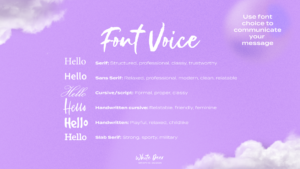
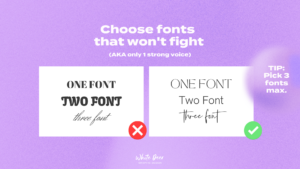
Remember that each font has its own voice so be careful not to pick 3 fonts that have 3 totally different voices. Instead, choose fonts that have similar voices OR 1 font that has a strong “voice” and 2 “backup” fonts that have less personality.
Here are some examples of common font types and the personality they tend to imply. This is just a SMALL example to get you started:

Next, look for inspiration. Check out websites and brands that you admire and take note of the fonts they’re using. Pinterest is a great resource for finding font pairings and search phrases like “feminine font pairings” or “classic font pairings” can help you find fonts that match your brand’s style.
Canva is another great tool for finding fonts. It can recommend fonts to you based on your preferences or you can search for specific fonts like “Serif font” to see all of the available options.
Making Intentional Decisions
Once you’ve found your perfect font pair, it’s important to make intentional decisions about how you use them. Don’t go overboard and use too many fonts – this can make your design look cluttered and unprofessional.
Instead, choose a font for your body text and then select a heading and subheading font that complement each other.
Be sure to use the same fonts across all of your platforms – from your logo to your social media posts and website. This creates a consistent brand image and makes it easy for your audience to recognize your brand.

Font pairing may seem like a small detail, but it can have a big impact on your brand’s image. Taking the time to find the perfect font pair and making intentional decisions about how you use them can help your brand stand out and create a cohesive look.
So, go forth and find your perfect font pair. I go over the nuances and examples of choosing a font in my Free Video Series:
Seriously in Business Challenge. You can unlock your free instant access here.
Not only will you learn how to choose your fonts but also create your own stunning visual brand, grow your business faster and feel (and look!) a million bucks – ready for your best year of business yet in this 3-part on-demand video training.
See you inside!
If you loved this episode as much as I loved sharing it with you…there is more where that came from!
-
Be sure to subscribe so you don’t miss out on future juicy design hacks. For bonus points and a little “eeeek” from me as I sit on the other end – I would LOVE if you would leave a review and rating. It’s a little thing that makes a big difference and helps me continue to produce more DIY goodness for you!