











Listen on Apple • Listen On Spotify
You’ve done the hard work. You’ve built your brand. You’ve got your colours, your fonts, maybe even a logo you’re pretty happy with… and you did it without spending thousands of dollars on a designer. So what now?
This is where most people either stall or start spiralling into an endless cycle of tweaks. I’m closing out this Brand on a Budget series with two things that don’t get talked about nearly enough: a five-minute quality check that will make any DIY Canva graphic look more polished, and a real conversation about why brand confidence is the missing piece for so many business owners.
5 Questions to Ask Before You Post Any Graphic
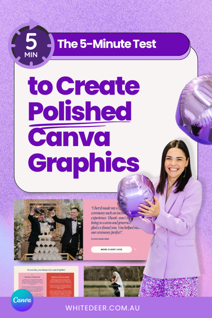
These five checks are what I call the Polish Pass. They take about five minutes, cost nothing, and will do more for the look of your Canva graphics than most design “hacks” you’ll find online.
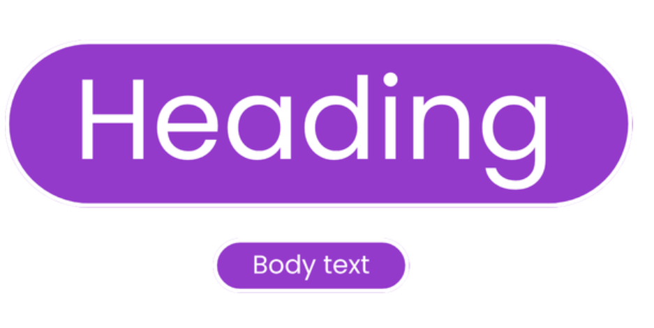
1. Do you have font size contrast?
The difference between a design that looks professional and one that looks a bit… flat, is often because of the difference in your heading size and the rest of your text. A large heading, smaller subheading, even smaller body text… that hierarchy makes your design look dynamic and interesting without you having to add a single extra element.
It sounds basic, but works every time.
2. What’s your image quality like?
Blurry stock photos. Telltale AI images. Random images sourced from Google. These affect how trustworthy your brand feels, and they’ll undo even the most beautiful brand colour palette.
Your two best options are:
- High-quality stock images (Canva’s library has excellent ones), or
- A well-lit photo you’ve taken yourself
Even a phone photo in good natural light beats a low-quality stock image every time.



33. Is everything on your design aligned?
This is one of the most telltale signs of a rushed DIY design – elements that are almost-but-not-quite lined up. Alignment doesn’t mean everything needs to sit in perfect symmetry, but things need to be aligned to something.
Your text boxes, your dot points, your little graphic elements… do they sit in a way that feels balanced? When they don’t, your design feels uncomfortable to look at, even if the viewer can’t pinpoint why.
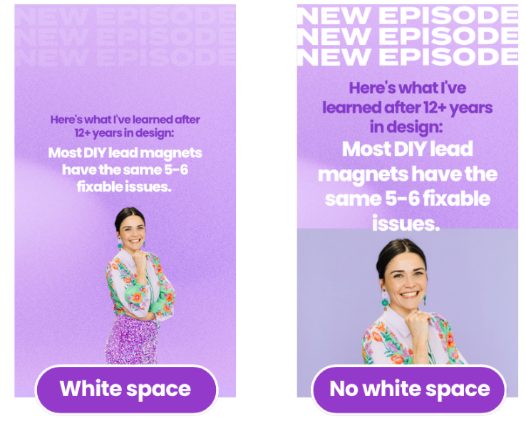
4. Does your design have white space?
Cluttered designs overwhelm the eye. White space in a graphic (or negative space, it doesn’t have to be literally white) gives your audience’s attention somewhere to rest. If your design feels busy, the answer is almost always to remove something, not add something.
5. Is everything on-brand?
This is your final check. Are you using your brand fonts, colours and style?
Every single element of every graphic you create should be traceable back to your brand. This is how recognition gets built over time.
The Confidence Piece (This Is the Bit Nobody Talks About)
You can have a genuinely great brand and still not be getting results from it, because you’re not showing up confidently behind it.
If you’re not proud of your Instagram, you’re going to hesitate before you tell someone to go look at it. If your website makes you cringe, you’re going to stop yourself from pitching. Your discomfort with your brand is literally costing you clients.
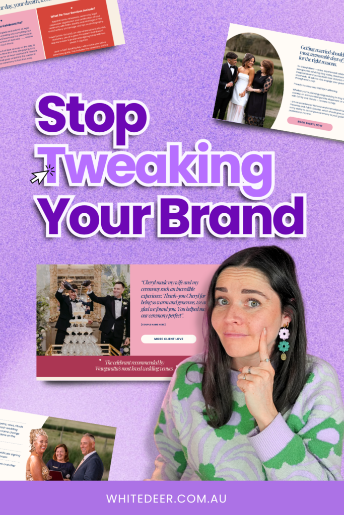
There’s also the “productive procrastination” trap. This is where you convince yourself that tweaking your brand colour or trying a new font is a legitimate business task, when really you’re avoiding something harder, like:
- That hard email you haven’t sent.
- The social media post you’ve been putting off.
- The pitch that scares you.
Every time you catch yourself tweaking your brand, ask yourself what you’re actually avoiding today.
Your Audience Can’t Tell What You Spent
This is a common misconception, but your audience genuinely cannot tell whether you paid $10,000 for your branding or whether you built it yourself.
What they can see is whether your DIY brand looks professional.
One of my DIY Design My Biz students built her brand through my course six years ago, has never changed it, and is now a six-figure business owner. The brand worked because she committed to it and used it consistently, not because it was expensive.
The power of a brand doesn’t come from perfection. It comes from repetition and time. There are hundreds of strong directions your brand could go, but your job isn’t to find the perfect one. It’s to find a good one, commit to it, and use it consistently until your audience starts to recognise you.
Ready to build a brand you’re actually confident in?
My free masterclass Design Tools to Get to 100K is a great place to start. You’ll see real examples of font contrast, Canva shortcuts, and the key ingredients of a brand that actually attracts clients.
And if you’re ready to go all in and build your brand properly from the ground up, DIY Design My Biz is the full course, which walk throughs how to pick fonts, colours, logos, templates and everything in between for a DIY brand that looks professional.
WORK WITH JACQUI:
// DIY Design My Biz: The best course for business owners DIYing their own brand and graphics in Canva. Learn more: https://whitedeer.com.au/diy-dmb
// The Co+Creation Design Club: Design WITH the help of a professional designer in this high-touch coaching space: https://whitedeer.com.au/designclub
// Design Studio: If you’re after fully done-for-you design services my studio team can help! https://whitedeer.com.au/designstudio