












Listen on Apple • Listen On Spotify
Here’s something that might surprise you: some of the most well-known business coaches out there have pretty simple brands. Not fancy or expensive, but consistent across different channels. And that’s what makes them feel trustworthy.
When you’re newer in business, you don’t have thousands of followers or glowing testimonials doing the trust-building for you. Your brand has to do it, so if your graphics look DIY, it’s costing you credibility with people who might have otherwise become clients.
In this three part series on designing your own business brand on a budget, I’m covering exactly what’s creating (or killing) visual trust in your business and how to find out where you stand right now.
How to create designs that build trust
When someone lands on your Instagram page for the first time, they’re not thinking “I wonder how much this person spent on their brand.” They’re asking, whether they know it or not: does this look like it was thought through?
What they’re responding to is consistency. A sense that someone made design decisions on purpose.
Use real photos over AI images
Consistent imagery is one of the clearest trust signals you can use. Not just consistent photos, but a consistent visual style: the same treatment, the same feel, across everything you put out. And yes, this includes photography.
Your own iPhone photos in natural light will signal more trust than polished AI imagery every single time.
Because when someone can see you, they can begin to trust you. AI imagery, or stock photos that look like stock photos, signal that you’re hiding. And people don’t pay money to people they can’t see.
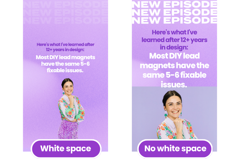
Use white space for professional looking designs
White space is another one that’s almost embarrassingly simple but incredibly effective design trick.
It’s not about having a blank or minimal design, but not filling every square inch of your graphic with text, icons, and imagery. Breathing room makes a design look professional.
Use consistent fonts and colours
Font pairing and colour palette cohesion round out the list. Your fonts should complement each other, not compete. And your colours should be speaking the same message, whether that’s calm, vibrant, neutral, or bold, rather than pulling in wildly different directions. (I cover how to choose colours that sell on my Youtube channel!)
The 3 Mistakes DIY Brands Make Most Often
I’ve seen these patterns across hundreds of businesses, and they’re fixable once you know what to look for.
1. Logo overuse
A lot of business owners get their logo and immediately want to put it on everything. But your logo isn’t actually doing what you think it is. When you’ve built a full brand with consistent fonts, colours, and style, the logo becomes almost unnecessary for recognition. I barely use mine on Instagram. What I use instead is my branding, which are my fonts, colours, photos and other brand assets, so my audience know exactly who it is.
Using your logo too big, too often, or as the hero of every design actually makes things more cluttered and less professional, not more.
2. No font system
If you’re using a different font every time you open a template that catches your eye, your audience can’t form a recognisable visual connection with you. Two to three fonts, used consistently across everything, is all you need. I have two fonts for my own business.
3. Colour creep
This one sneaks up on you. You start with a colour palette, then you find a cute template in a different colour scheme, then another, then another. Before you know it, your flyer looks nothing like your Instagram posts, and your first post looks nothing like your latest one. Colour creep signals that you’re just grabbing templates as you go rather than making intentional choices, and that causes your brand to lose trust.
The 4-Question Brand Audit
Pull up the last nine Instagram posts you’ve created, or as many of your recent graphics as you can find. Then ask yourself these four questions.
1. Am I using one consistent colour palette? Can you see colour creep? Do your flyers and your social posts share the same colours, or have you been quietly borrowing from whatever template felt right at the time?
2. Am I using the same two to three fonts in everything? Look at every graphic. Are the same fonts appearing across all of them? Or can you spot a few “oh I liked that one” moments where a different font snuck in?
3. Am I overusing my logo? If your logo is appearing more than once on a flyer, or regularly popping up on your social posts, it’s time to dial it back. Let your consistent brand style carry the recognition instead.
4. Does everything feel like it’s coming from the same place? This is the big one. Step back and look at all your graphics together. Could someone pick one at random and another at random and tell they came from the same business? When the answer is yes, consistently, that’s when you know your brand is starting to do the trust-building work for you.
What to Do If Your DIY Brand Isn’t Consistent
You don’t need to start over. Look at what you’ve already created and find the threads of consistency that are already there. Build yourself a simple style guide: colours, fonts, visual approach…and start following your own rules.
I cover all of this and more in my free masterclass, Design Tools to Get to 100K Online. You’ll get a free style guide template, a live Canva demo, and a walkthrough of the exact design mistakes that are probably costing you credibility right now.

WORK WITH JACQUI:
// DIY Design My Biz: The best course for business owners DIYing their own brand and graphics in Canva. Learn more: https://whitedeer.com.au/diy-dmb
// The Co+Creation Design Club: Design WITH the help of a professional designer in this high-touch coaching space: https://whitedeer.com.au/designclub
// Design Studio: If you’re after fully done-for-you design services my studio team can help! https://whitedeer.com.au/designstudio