
")


Listen on Apple • Listen On Spotify
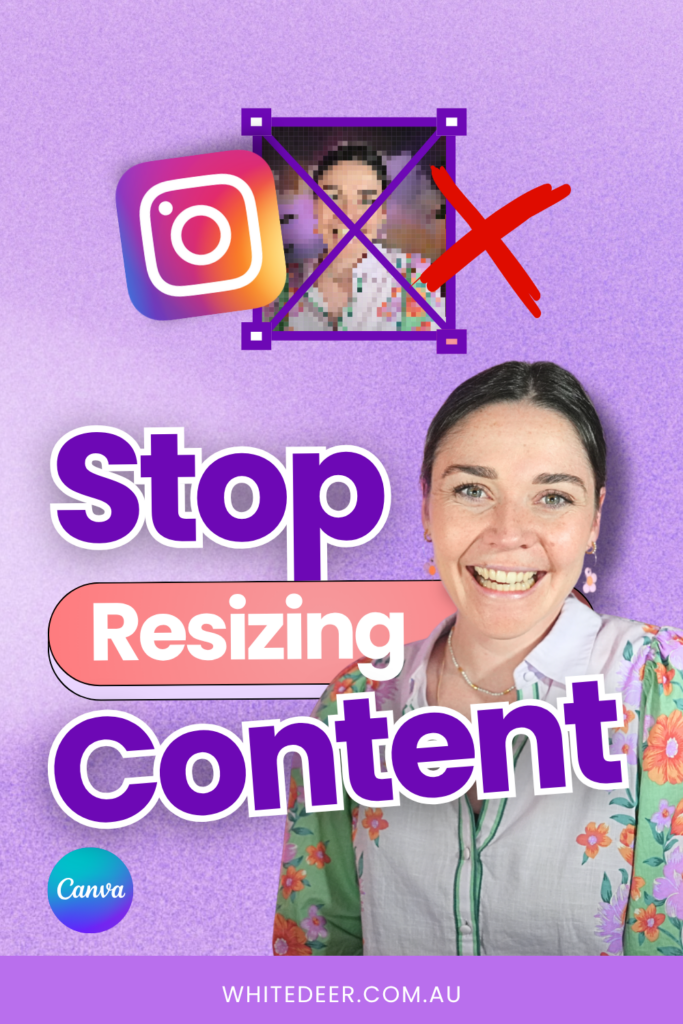
You spend hours on your podcast. You bring in your team to help repurpose it. And then… the graphics go out, and nothing really happens. No DMs, no click-throughs, no noticeable momentum. Before you start questioning whether your content was good enough, stop. It might not be the content at all.
In this blog, I cover why design, specifically inconsistent, low-quality, or poorly repurposed design, is one of the most underestimated revenue problems in service-based businesses. Plus the exact system I use with my team as the fix.

Why good design matters
Before your audience reads a single word of your caption, they’ve already made a judgment. If what they see doesn’t stop them, your content might as well not exist. The ManyChat automation doesn’t trigger, the link doesn’t get clicked, the offer never gets seen.
I call this the scroll past tax. It’s the invisible cost you’re paying every time a graphic doesn’t earn its place in the feed. And it compounds. Post by post, week by week, it starts to make a real difference to your growth.
If your graphics aren’t stopping the scroll, your best content is going unseen. The copy doesn’t matter if the design doesn’t land first.
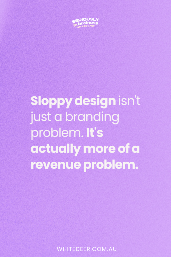
How sloppy design ruins your credibility
For business owners with higher-ticket offers, design inconsistency isn’t just an aesthetic issue. Your audience is using the way you look as a proxy for how you’ll perform. If your posts feel scattered, with different fonts, off-brand colours, layouts that look rushed, they’re drawing conclusions about your business before they’ve even read your bio.
Another thing that most people miss: inconsistent design doesn’t just cost you clients. It can quietly suppress your prices too. When your visuals don’t match the level you’re working at, it becomes harder to attract and hold the clients who can pay at that level.
Your graphics are either building trust or quietly eroding it.
The hidden time drain of fixing bad design
Be honest: how long do you actually spend tweaking your team’s graphics before they go out? If you’re not tracking it, use Toggl for a week and time yourself. If your hourly rate is $500 and you’re spending three hours a week on this, that’s $1,500 of your time going to a task that shouldn’t need you at all.
And if your answer is “I just let the team post whatever they’ve done”? That’s not a solution either.
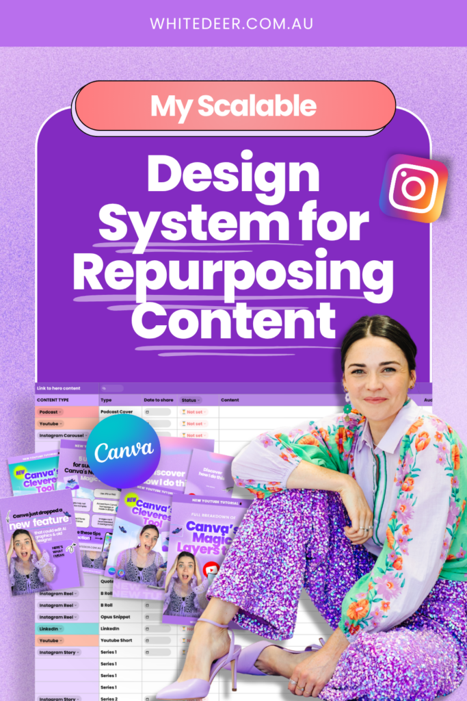
The fix isn’t hiring a designer
This is where a lot of business owners get it wrong. The problem isn’t a lack of design skill on your team. It’s a lack of system. Without a clear, followable process, your team defaults to their best guess, and your approval process lives entirely in your head, which means you become the bottleneck for everything.
So I created the fix. My Hero Design System is a step-by-step process my team follows. That means graphics go out at a consistent standard, across every platform, without me needing to be involved at every stage. I can approve a full week of content in under two minutes because the system holds the standards for my graphics.
Join the free Hero Design System masterclass to see this in action
I’ll walk through exactly what the Hero Design System looks like inside my business, including who touches what, how they plan content, and what’s performing on platforms like Instagram right now.
You can come as the business owner, send your team, or share the replay. The goal is to leave with a clear picture of what a functional design system actually looks like so you can stop patching things and start showing up at the level your business is already operating at.
Join the Hero Design System Masterclass: https://whitedeer.com.au/hero
WORK WITH JACQUI:
// DIY Design My Biz: The best course for business owners DIYing their own brand and graphics in Canva. Learn more: https://whitedeer.com.au/diy-dmb
// The Co+Creation Design Club: Design WITH the help of a professional designer in this high-touch coaching space: https://whitedeer.com.au/designclub
// Design Studio: If you’re after fully done-for-you design services my studio team can help! https://whitedeer.com.au/designstudio


