











Listen on Apple • Listen On Spotify
You’ve got a brand that you spent real time on in Canva. But something still feels slightly off, and you can’t quite put your finger on why.
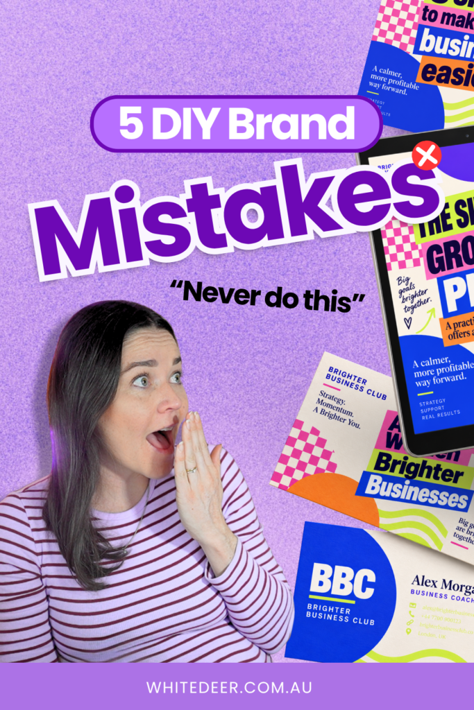
After reviewing 50 brands that business owners had DIY’d themselves, I notice the same 5 design mistakes coming up over and over again. They are not a problem with the logo or colour. They’re sneaky, in-between things that undermine an otherwise decent-looking brand and send potential clients scrolling past.
In this blog I break down these 5 design mistakes business owners make in their DIY brand, and how to fix them.
1. You haven’t been clear on what your brand is actually there to do
Most business owners approach design backwards. They open Canva, find a colour palette they love, pick a font that feels vaguely on-brand, and start creating. Which works fine… until a stranger lands on your website or Instagram for the first time and has no idea what you actually do, who it’s for, or whether they should trust you.
Research from Carleton University found that it takes about 50 milliseconds (less than a blink!) for someone to form a judgment about your brand. They’re not reading your words in that time. They’re making a snap decision based entirely on the visual. So if your design isn’t strategically built to communicate your values, your niche, and your credibility in a fraction of a second, it’s working against you.
2. Your text doesn’t have enough contrast from its background
Low contrast text is one of the most common design problems I see, and it shows up in a lot of ways:
- Text that’s too thin that it’s unreadable
- A light colour on a slightly lighter background, or
- Copy placed over a busy photo that makes it impossible to see
A Stanford study found that poor visual design was the number one reason people said they didn’t trust a business online, cited in 46% of responses. If your audience has to squint or work hard to read your text, they won’t. They’ll just keep scrolling.
The fix is simple: check your contrast deliberately.
Is the text bold enough?
Is the colour different enough from the background?
If you’ve placed text over a photo, is the image beneath it too busy or too close in tone to what’s on top? If yes, sort it out before you publish.
3. You’re centring your body text
Centring text looks elegant on a headline or a short tagline. On a full paragraph, it becomes genuinely exhausting for your audience to read, because their eyes can’t find where each new line starts.
In Western reading patterns (left to right), our eyes naturally seek that left-aligned anchor. Take it away and processing becomes harder. People don’t consciously notice this, they just find themselves losing interest or skipping the copy entirely, without knowing why.
The rule is if it’s more than a sentence or two, left align it. It’s one click in Canva and it makes your designs significantly easier to read.
4. You’re using too many fonts
Psychology research on something called processing fluency shows that if something is easier to read, people are more likely to perceive it as credible and true. Which works the other way too: if your fonts are hard to read, layered, or inconsistent, your audience is subconsciously downgrading your trustworthiness.
Too many fonts create visual noise. They make the eye work harder to figure out the hierarchy of information. And when things are hard to process, people just scroll past.
You don’t need to strip all personality from your brand. But sticking to a clear, consistent font system (typically two, maybe three, fonts with defined roles) makes your designs cleaner and your brand more professional.
5. You haven’t checked how your design looks on mobile
You’ve been designing on a laptop screen. Your audience is probably seeing it on a phone. Those are two very different viewing experiences, and a design that looks polished on desktop can completely fall apart on mobile.
I recommend a minimum of 16px for body text on websites and PDFs, and at least 20px for social media. And more importantly: actually test it. Send the design to your phone, pull up your website on mobile, open that PDF on a smaller screen. See how it actually looks before it goes out.
Brands that present themselves consistently across every platform report a 33% increase in revenue, because consistency builds recognition, which builds trust. But none of that consistency will land if your audience literally can’t read what you’ve put out there.
What to Do If You want a DIY Brand that Looks Professional
You don’t need to start over. Look at what you’ve already created and check if you’ve made any of these design mistakes, then fix them.
I cover all of this and more in my free masterclass, Design Tools to Get to 100K Online. You’ll get a free style guide template, a live Canva demo, and a walkthrough of the exact design mistakes that are probably costing you credibility right now.
WORK WITH JACQUI:
// DIY Design My Biz: The best course for business owners DIYing their own brand and graphics in Canva. Learn more: https://whitedeer.com.au/diy-dmb
// The Co+Creation Design Club: Design WITH the help of a professional designer in this high-touch coaching space: https://whitedeer.com.au/designclub
// Design Studio: If you’re after fully done-for-you design services my studio team can help! https://whitedeer.com.au/designstudio