








Creating a full brand in 30 minutes is hard. Like, genuinely hard. It is a fun challenge, but it is not how you should build your actual business brand.
A proper brand process needs strategy, research, clarity around your audience, and time to explore what makes you original. But when you need to move quickly, you can still create a thoughtful starting point inside Canva if you know how to make strong decisions without overthinking every tiny detail.
This was the challenge: create a brand for Stay Soft Studio, a reformer Pilates and recovery space built for women who want gentle movement, nervous system regulation, and a calm alternative to intimidating fitness environments.
Table of Contents
- Step 1: Read the brief for the feeling, not just the industry
- Step 2: Build a quick mood board before designing the logo
- Step 3: Choose a colour palette that supports the brand feeling
- Step 4: Find an original logo concept in the brand name
- Step 5: Hand-draw your icon and use Canva Trace to vectorise it
- Step 6: Set yourself up properly in Canva
- Step 7: Duplicate before you commit to a direction
- Step 8: Pair soft and structured typography
- Step 9: Create logo variations for different uses
- Step 10: Extend the logo into a full visual identity
- Step 11: Use Canva photo collections to find on-brand imagery faster
- Step 12: Do not confuse more elements with a better idea
- Step 13: Build your real brand with deeper strategy
- Step 14: Give yourself permission to make the first version
Step 1: Read the brief for the feeling, not just the industry
The brief is not simply “Pilates studio.” If you only design for the industry, you will probably end up with a generic fitness logo, a reformer icon, or something that feels overly strong, clinical, or sporty.
The real opportunity sits in the emotional language of the brief:
- Emotionally calm
- Gentle movement
- Recovery
- Nervous system regulation
- Welcoming
- Soft
- Comfortable
- Feminine without being overly delicate
Before you open Canva and start placing elements everywhere, pause and anchor yourself in the keywords. They become your decision-making filter. If an image, font, colour, or icon does not feel calm, soft, safe, and restorative, it probably does not belong in this brand.
For Stay Soft Studio, the goal was to create something that felt worlds away from a high-intensity gym environment.
Step 2: Build a quick mood board before designing the logo
Even under a tight time limit, start with visual research. Pinterest is incredibly helpful here because it lets you see ideas, colour palettes, typography, textures, photography, and layouts in context.
You are not looking for something to copy. You are looking for visual clues that help you articulate what the brand should feel like.
For this Pilates and recovery brand, the strongest visual references leaned into:
- Earthy pinks, clay browns, muted greens, and soft blues
- Natural textures and grain
- Clouds, water, stones, droplets, and flowing forms
- Rounded shapes and arches
- Gentle, editorial-style movement photography
- Modern typography that would not feel out of trend next week
One direction used forest, river, clay, and stone references to communicate grounded calm. The other used sky and cloud imagery to communicate spaciousness, recovery, and the feeling of opening up your horizons after injury or limitation.
Both routes made sense because they served the same emotional destination: soft, regulated, welcoming movement.
Important: inspiration is not plagiarism. Pull out the qualities that work, then alter the colours, forms, composition, and concept until the direction becomes distinctly yours.
Step 3: Choose a colour palette that supports the brand feeling
Colour does a lot of the heavy lifting when you are trying to communicate emotion at a glance.
For Stay Soft Studio, harsh black, bold primary colours, and neon fitness tones would have pulled the brand toward intensity. Instead, the palettes were built around softer, more restorative tones.
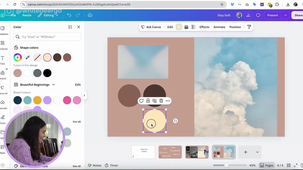
Option one: earthy recovery colours
The first direction paired natural browns, clay pinks, and a muted green. It felt like a peaceful place near a river or in a forest: grounded, meditative, and healing.
The pink clay tones added femininity, while the browns kept the brand mature and earthy rather than overly sweet.
Option two: soft sky colours
The second direction used dark and medium browns, a pale background brown, warm yellow, and soft blue. The blue was inspired by the sky and cloud imagery, creating a more open and hopeful interpretation of recovery.
When someone is injured or disconnected from their body, they can feel a little trapped. A softer sky-blue direction can represent possibility, perspective, and returning to what they want to achieve.
There is no single “right” palette. The important thing is that every colour has a role and contributes to the same emotional world.
Step 4: Find an original logo concept in the brand name
When a name gives you something visually useful, use it. “Stay Soft Studio” has three S letters, so naturally the S became the place to explore.
But do not stop at simply placing two S letters beside each other. It needs an added idea to feel more original and intentional.
One logo direction explored the S forms through the idea of:
- Flowing water
- Droplets
- Stacked stones
- Balance
- Soft, rounded movement
The result was an icon with layered, flowing S-inspired shapes. It suggested calm, healing, and the restorative side of the studio, rather than just Pilates.
The other direction turned an S sideways so it felt more like a moving body. It began as a hand-drawn shape and had a slightly eyelash-like quality, which was not necessarily a bad thing for a feminine studio, provided it did not start looking like a lash business.
That is an important design lesson: notice accidental associations, but do not panic the second something resembles something else. Check it against the wider brand system. Context matters.
Step 5: Hand-draw your icon and use Canva Trace to vectorise it
If you cannot find the exact icon you want in Canva, draw it.
Start with a thick, dark pen on plain paper. Keep the shape simple and embrace a slightly rustic, imperfect look. That hand-drawn quality can be a feature, especially for a brand that is meant to feel human, soft, and welcoming.
Once you have your sketch:
- Take a clear photo with your phone.
- Send the image to your computer and upload it to Canva.
- Crop tightly around the drawing.
- Adjust the brightness if necessary to make the background cleaner.
- Lower saturation if the paper looks too orange.
- Use the Canva app called Trace.
- Add the traced version back into your design.
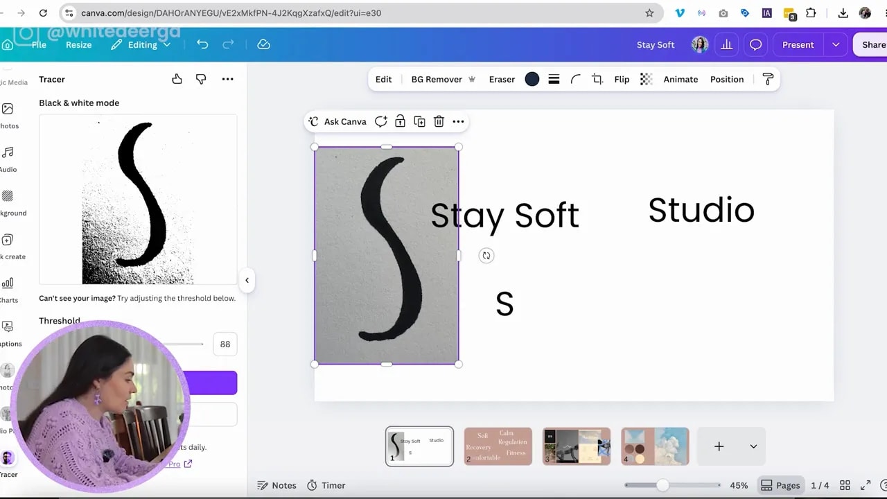
Trace turns the image into a vectorised element, rather than leaving you with a basic photo of a drawing. That gives you a cleaner result that can be resized while staying crisp enough for a logo.
Your trace may still have a little jaggedness, and that is okay if it aligns with the visual direction. Not every brand needs to be perfectly polished and geometric.
Step 6: Set yourself up properly in Canva
A tiny technical choice can make your design process much easier. If you are working in Canva through a browser, use Chrome rather than Safari if you want access to the eyedropper tool for picking colours from inspiration images.
You can also use the Canva app.
Colour picking is especially useful when you are building a palette from a mood board. It helps you pull tones directly from the imagery that inspired your direction, then adjust them until the palette feels like your own.
Canva also has plenty of photos and elements, but be selective. If an element feels cliché, it can instantly make the finished brand feel less considered. Search for imagery that supports your concept rather than reaching for the first obvious Pilates photo.
Step 7: Duplicate before you commit to a direction
This is one of the best Canva habits you can build: duplicate your design before making a major change.
When you are unsure whether a concept is working, duplicate the page or file and keep moving. That lets you test a new direction without deleting the version you may want to return to later.
FREE Design Tools to $100k Masterclass
Grow your biz with clever design and Canva hacks that will save you hours and make you sales.
Design is rarely one brilliant idea that appears fully formed. Most of the time, there are messy pages, variations, half-developed concepts, font tests, and elements that almost work.
That is completely normal. Do not feel bad for needing multiple options. In a studio process, there are often far more concepts explored than anybody ever sees.
Under time pressure, this becomes even more important. You need freedom to experiment without the fear of losing a good thought halfway through.
Step 8: Pair soft and structured typography
The typography needed to feel soft, but still professional enough for a credible Pilates and recovery business.
One direction used a more expressive, soft display font for “Stay Soft,” then paired it with a slightly more rigid sans serif typeface. That contrast helped create balance. The display font carried the warmth and personality, while the sans serif kept the system clean and classic.
Canva’s font recommendation feature can be surprisingly helpful. Sometimes you select a font that is not quite right, and Canva suggests something that works far better with the icon or visual direction you have already created.
For this brand, the font Nadira was a standout discovery. It had a soft, characterful feel that suited the concept beautifully.
An accent font does not need to appear everywhere. Use it sparingly in larger moments, headline treatments, social templates, or selected brand touchpoints. Consistency is not about using every element all the time. It is about making each element feel like it belongs to the same world.
Step 9: Create logo variations for different uses
A logo is not one fixed arrangement that you use everywhere forever. A useful brand needs variations.
For Stay Soft Studio, the primary logo was designed for large-format uses, such as:
- Studio signage
- Banners
- Large printed materials
- Feature website sections
In a larger primary lockup, you can include the descriptor “Pilates & Recovery” because there is enough space for it to remain legible.
But at small sizes, that descriptor becomes too tiny to read. For social media, favicons, small labels, or profile images, you need a simpler version.
Useful variations can include:
- A full primary logo with the business descriptor
- A simplified horizontal wordmark
- A stacked logo
- An abbreviated “SS” mark
- An icon-only version
- A circular logo variation
If small text will not be visible, do not force it in. Legibility always wins.
Step 10: Extend the logo into a full visual identity
A logo is only one piece of a brand. Once you have the core mark, create a few supporting elements that make everything feel consistent.
For the earthy direction, that could include:
- Wavy lines
- Rounded arches
- Flowing forms
- Stone or droplet-inspired motifs
- Subtle grain texture
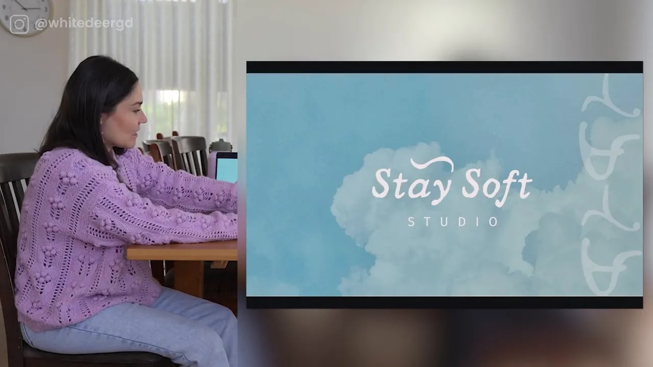
For the sky-inspired direction, the supporting system included small pose illustrations in the same line style as the logo, plus cloud imagery and blue gradients.
Those illustrations represented gentle recovery poses, such as lying down with a leg raised or holding the legs while resting on the floor. Because they used the same visual language as the logo, they could sit together across social media graphics, printed materials, and studio touchpoints without feeling random.
Small icon variations also work well as subtle flourishes at the edge of a design, at the bottom of a social post, or as a recurring detail in branded templates.
Step 11: Use Canva photo collections to find on-brand imagery faster
When you find a photo in Canva that feels right, do not stop at that one image. Click the photo and look for View collection in the three-dot menu, or explore Canva’s magic recommendations.
When available, this helps you find other photos from the same collection. That is incredibly useful because the images are more likely to share the same lighting, subject matter, styling, and overall feeling.
For a soft Pilates brand, that means you can find a cohesive group of imagery instead of relying on unrelated stock images that all feel slightly different.
Photography should feel like part of the brand system, not decoration added at the end.
Step 12: Do not confuse more elements with a better idea
When you start feeling unsure, it is tempting to add more. More graphics, more colours, more icons, more layouts, more texture.
But doing more does not automatically make the concept stronger. Sometimes you are adding things because you do not fully trust the original idea.
When you catch yourself doing that, pause and ask:
- Does this element add meaning?
- Does it make the brand more recognisable?
- Does it support the feeling from the brief?
- Would the design be better if I removed it?
In a rushed challenge, it is perfectly fine to make decisions and keep moving. In a proper branding process, give yourself enough time to step away, revisit the work, and refine what is genuinely working.
Step 13: Build your real brand with deeper strategy
Yes, you can create a logo and a basic brand direction in Canva in 30 minutes. But for your real business, do not rush the strategy.
Go deeper into:
- Your who: Who are you trying to attract?
- Your why: Why does your business exist beyond selling the service?
- Your originality: What makes you different from other options in your industry?
- Your emotional promise: How should people feel when they encounter your brand?
- Your visual language: Which colours, type, imagery, and forms best communicate that promise?
When you do that work properly, your logo, website, Instagram, imagery, and colour palette all start communicating the same thing at a glance.
That is the goal. You want someone to immediately understand the energy of your business before they have even read every word.
If you want support creating your own strategic, cohesive brand inside Canva, you can explore DIY Design My Biz. If you would rather build it collaboratively with design support, the Co+Creation Design Club is designed for exactly that. And if you want your brand fully created for you, explore the White Deer studio.
Step 14: Give yourself permission to make the first version
The biggest lesson from a 30-minute Canva logo challenge is not that you should rush your whole brand. It is that you are more capable than you think once you have a clear brief, a visual direction, and the confidence to test ideas.
Start with the feeling. Gather references. Make thoughtful choices. Duplicate your pages. Explore variations. Keep the concept simple enough to work at small sizes. Then build a brand system around it.
And if your first concept accidentally looks a little like an eyelash, just check whether it still works for the bigger brand idea before you throw the whole thing away.