













A lead magnet can contain genuinely brilliant information and still struggle to build trust if it feels hard to read, cluttered, or a little bit homemade. Good graphic design is not only about making something pretty. It is about strategically communicating, making the content easy to consume, and helping your business look as credible as the work you do.
These Canva design tweaks come from a real lead magnet makeover for a menopause resource. The original design already had lots going for it: thoughtful content, a clear topic, a lovely photo, and brand colours beginning to take shape. The goal was not to start from scratch. It was to make intentional adjustments that made every page calmer, clearer, more readable, and more cohesive.
Table of Contents
- Step 1: Set Your Lead Magnet Up at the Right Size
- Step 2: Give Your Cover a Calm, Clear Visual Hierarchy
- Step 3: Create Contrast That Makes Every Word Easy to Read
- Step 4: Design Every Inner Page With Printing in Mind
- Step 5: Make Body Text Comfortable on Both Phone and Paper
- Step 6: Simplify Decorations So the Content Stays the Hero
- Step 7: Repeat Your Best Design Decisions Across the Whole PDF
- Step 8: Export a Professional PDF and Let Your Design Build Credibility
Step 1: Set Your Lead Magnet Up at the Right Size
Before you touch fonts, colours, or layout, check your document dimensions. The starting design was 512 by 800 pixels, which is not disastrous for a screen-based resource, but it is far too small for something that might be downloaded and printed.
Your lead magnet should feel good both on a computer and as a physical document. For that, begin with a standard page size:
- Use A4 if your audience is in Australia or another country that uses A4.
- Use US Letter if your audience is primarily in the United States.
In Canva Pro, select Resize, choose a print format, then search for the page size you need. For an Australian PDF, choose Flyer A4 Portrait. If you only want the revised version, choose Resize design rather than creating a copied version.
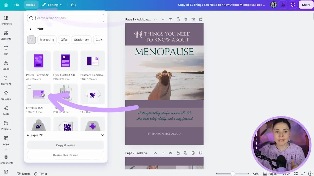
If you do not have Canva Pro, create a new document at the correct size and copy your design elements across. It is a little more fiddly, but getting your foundation right is absolutely worth it.
Canva may display a print danger zone near the edges. This is a helpful reminder that important text and design elements should stay well inside the page boundary, especially if your PDF may be printed.
Step 2: Give Your Cover a Calm, Clear Visual Hierarchy
Your cover has one job: make it immediately obvious what the resource is about and who it is for. You do not need to fit every message on there. You need a strong focal point, a clear title, a helpful subtitle, and room for the design to breathe.
The menopause guide cover had a beautiful beach image with open sky. That open area is valuable white space. White space is simply the quieter, less busy area in your design. It gives your text somewhere to sit and keeps the overall feeling elevated rather than cluttered.
Instead of dividing the cover into lots of smaller sections, simplify it into two clean visual areas:
- A strong image section with enough calm space for the title.
- A lower section for the supporting message and author name.
If your photo is sitting inside a plain square Canva frame, consider detaching the image from the frame. A standard rectangular photo usually gives you more flexibility to enlarge, crop, and position it cleanly.
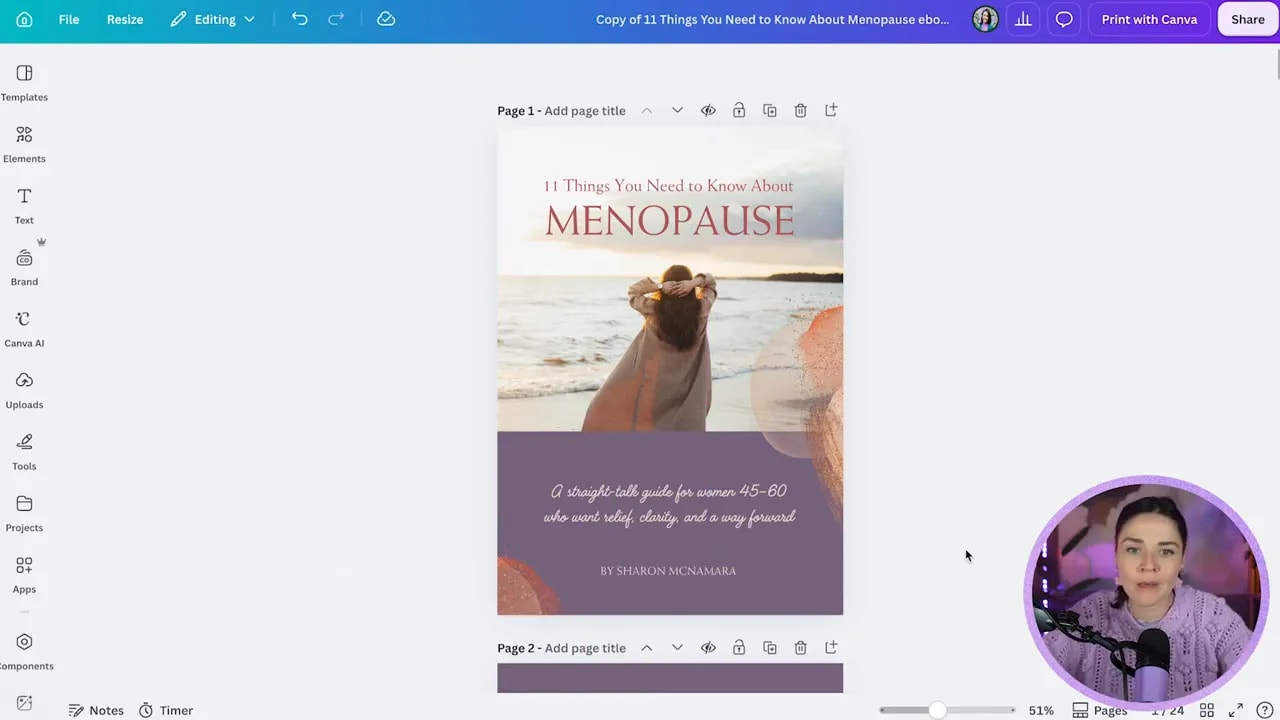
Make the most important words the most visually prominent. In this example, “MENOPAUSE” deserved the attention, so the decorative “11 things” styling was removed. The fancy font was pulling attention away from the actual subject of the guide.
Keep most title text in sentence case or lowercase because uppercase text is generally more difficult to read. Using capitals for one short, important word is completely fine. Using capitals for an entire long heading makes people work harder than they need to.
Step 3: Create Contrast That Makes Every Word Easy to Read
If something feels a little “off” in your design, contrast is often the issue. In the original cover, dark green text sat over purple. A box had been placed behind the copy to make it more visible, which was a smart instinct, but the result still felt heavy and difficult to read.
Rather than adding more blocks and layers, simplify. Remove the unnecessary box and choose a lighter text colour that has enough contrast with the background.
Contrast does not mean every page must be stark black and white. You can absolutely use beautiful brand colours. It simply means you need enough distinction between the text and whatever sits behind it.
For body copy especially, your safest and most readable choice is dark text on a light background. Light text on a dark background can look dramatic, but it takes more effort to read. This becomes even more important when you are designing for an audience whose eyes may find low-contrast text more challenging.
Use darker brand colours for headings, black or deep charcoal for body copy, and save accent colours for highlights, quotes, or small decorative moments.
Step 4: Design Every Inner Page With Printing in Mind
Here is the slightly annoying but very important question: could someone want to print this PDF?
A dark cover is usually fine because it is only one page. But a 24-page PDF filled with dark purple backgrounds will use a massive amount of ink. That can discourage people from printing the resource altogether, particularly if they prefer a hard copy.
You do not need to put “Please print me!” on every page. You simply want printing to remain a viable option.
For interior pages, flip the approach:
FREE Design Tools to $100k Masterclass
Grow your biz with clever design and Canva hacks that will save you hours and make you sales.
- Use a white or very light background.
- Use brand colours as highlights, shapes, headers, and quote accents.
- Keep body text dark and legible.
- Let decorative elements support the page without competing with the content.
This shift makes the resource easier to print, easier to read on screen, and much less visually heavy. It also gives your pages a fresher, more professional feel.
Step 5: Make Body Text Comfortable on Both Phone and Paper
Lead magnets have a tricky little job. They need to work on a phone screen, a computer, and possibly on paper. Tiny text is one of the quickest ways to make great content feel inaccessible.
A body font size of 10.9 is not a deal breaker, but it is on the small side. Aim for around 11 or 12 for a printable guide. If your PDF does not contain much text, you can happily go larger, around 13 or 14, so people do not need to zoom in constantly on their phones.
Then clean up the spacing. Your body copy should feel open and easy, not squeezed into a box.
Use generous internal margins
Do not place your text right against the edge of a coloured box. Leave breathing room on all sides. More internal space makes the content feel more inviting and easier to read.
Left-align paragraphs
For paragraphs, choose left alignment rather than justification. Justified text stretches individual lines to meet both edges of a text box, which can create strange gaps between words. Left-aligned text feels cleaner and is much easier to scan.
Remove extra letter spacing in body copy
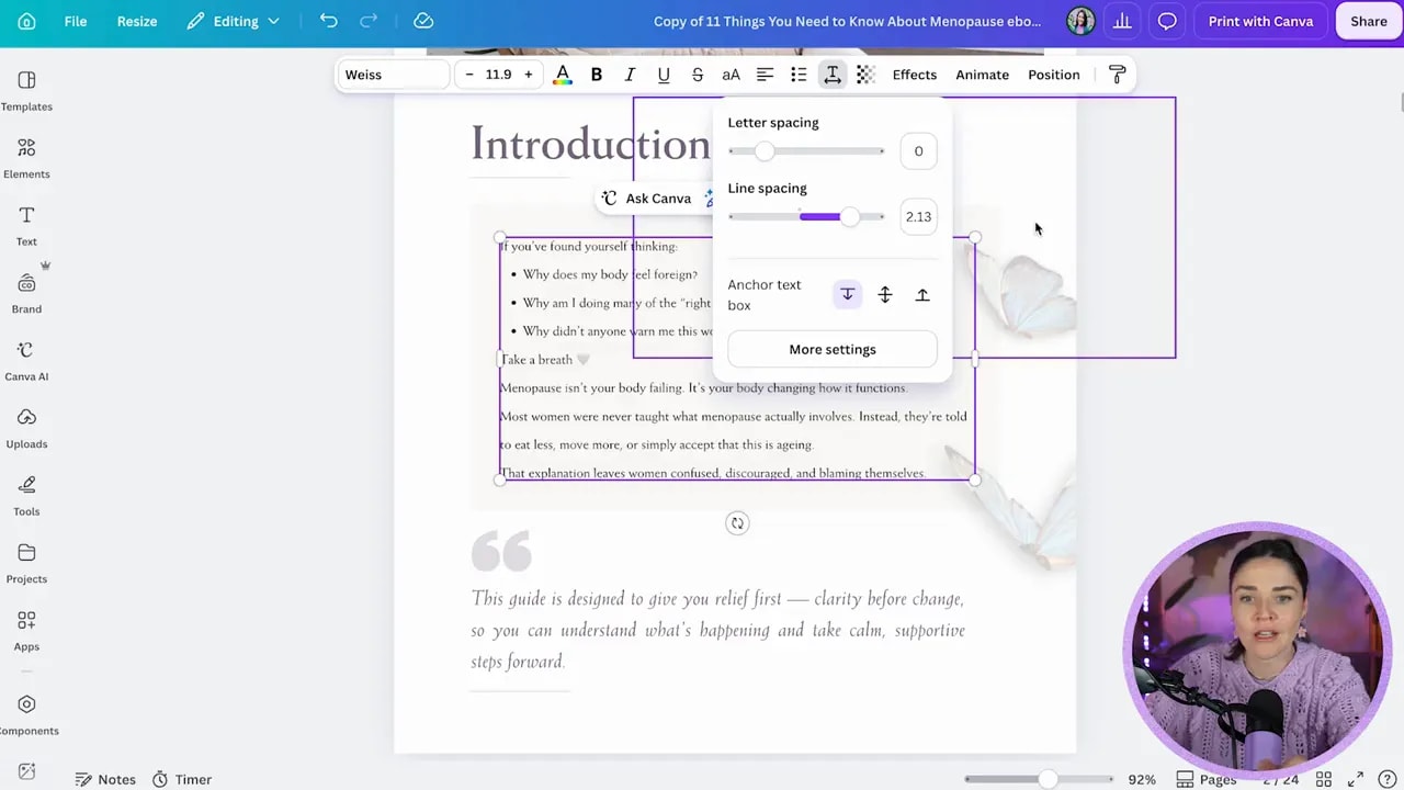
Extra letter spacing might look decorative in a short heading, but it makes paragraphs more difficult to read. Keep letter spacing at zero for body text unless there is a very specific reason to change it.
Delete rogue returns
Extra line breaks at the bottom of a text box make Canva frustrating to work with and make layout alignment harder. Click into the text box and delete spare returns so the box hugs the text more naturally.
Step 6: Simplify Decorations So the Content Stays the Hero
Decorative elements can carry your brand personality across a PDF, but they should never overwhelm the words. In this guide, butterflies were used as a recurring visual motif. Lovely idea. The tweak was simply to use fewer of them, place them away from body text, and avoid duplicate images that made the page feel busy.
When you are deciding whether to keep a decorative element, ask yourself one question: Is this helping the message, or is it getting in the way?
Keep the elements that frame a quote, soften a page, or connect different sections. Remove anything overlapping important copy or pulling focus from the hierarchy.
You can also borrow a few visual cues from other existing brand assets to create consistency. For example, a warm gold or peach accent from a related podcast graphic can bring a cover together beautifully when used sparingly alongside purple.
Do not force every element to change colour, either. Some Canva graphics are not built in a way that makes recolouring work nicely. If it looks weird, it looks weird. Leave it, replace it, or choose a different element.
Step 7: Repeat Your Best Design Decisions Across the Whole PDF
Once you have refined your cover and one or two interior pages, do not reinvent the wheel for every page. Carry the same core decisions throughout the document:
- White or light backgrounds for content-heavy pages.
- Dark body copy and clear contrast.
- Consistent heading hierarchy.
- Comfortable text margins inside boxes.
- Limited, intentional decorative elements.
- Brand colours used as accents rather than full-page backgrounds.
Consistency is what turns a set of separate Canva pages into a real, professional lead magnet. It creates recognisability, builds trust, and makes the document feel easier to consume from beginning to end.
Templates can be a brilliant starting point, by the way. You do not need to agree with every decision inside one. If a template has a random line, awkward box, too-tight text, or a decorative feature that is not serving your content, delete it. You are allowed to make it work for your business.
Step 8: Export a Professional PDF and Let Your Design Build Credibility
When your design is consistent and readable, export it by selecting Share, then Download, and choosing PDF Standard. That file is ready to deliver as a lead magnet that does more than contain helpful information.
It becomes a resource people actually want to open, can comfortably read, and may choose to print. And that polished experience quietly builds your credibility. It tells people that you care about the details, understand their needs, and have created something worth their time.
That is the power of good design, my friends.
If you are ready to stop winging it in Canva and create graphics that support your business properly, you can join the free Design Tools to $100K masterclass. You will learn more Canva shortcuts, credibility-costing design mistakes to avoid, and a practical approach to building a brand that attracts the right people.
For hands-on lessons, templates, branding support, and design feedback, explore DIY Design My Biz.