











Shadows seem like such a tiny detail, but they are one of the quickest ways to tell whether a Canva design feels polished or a little bit off. Done well, a shadow adds depth, separates layers, and makes your graphics feel more premium. Done badly, it makes everything look murky, heavy, and amateur.
The good news is that professional-looking shadows do not require much extra work. You simply need to use them with purpose. Your shadow should support the design, not become the design.
Table of Contents
- Step 1: Follow the one rule that keeps shadows looking professional
- Step 2: Add a subtle drop shadow to text in Canva
- Step 3: Apply Canva photo shadows with realistic settings
- Step 4: Create more premium shadows with Canva Elements
- Step 5: Add environmental shadows only when they suit your brand
- Step 6: Add shadows behind cutout people
- Step 7: Turn your shadow style into a recognisable brand detail
Step 1: Follow the one rule that keeps shadows looking professional
Do not add shadows to dark text.
It is tempting when a design feels flat. You have a beautiful dark heading on a coloured background, so you add a black Glow or Drop effect to make it more interesting. But dark text plus a dark shadow quickly creates visual mud. Instead of making the wording clearer, it makes the edges less crisp and the whole graphic harder to read.
Good design should create clarity. If the effect makes your text less clear, it is not helping.
If you want text to have a shadow, use light text on a darker background. A subtle dark shadow behind white or pale lettering helps lift it away from the background, making it feel crisper while adding a little dimension.
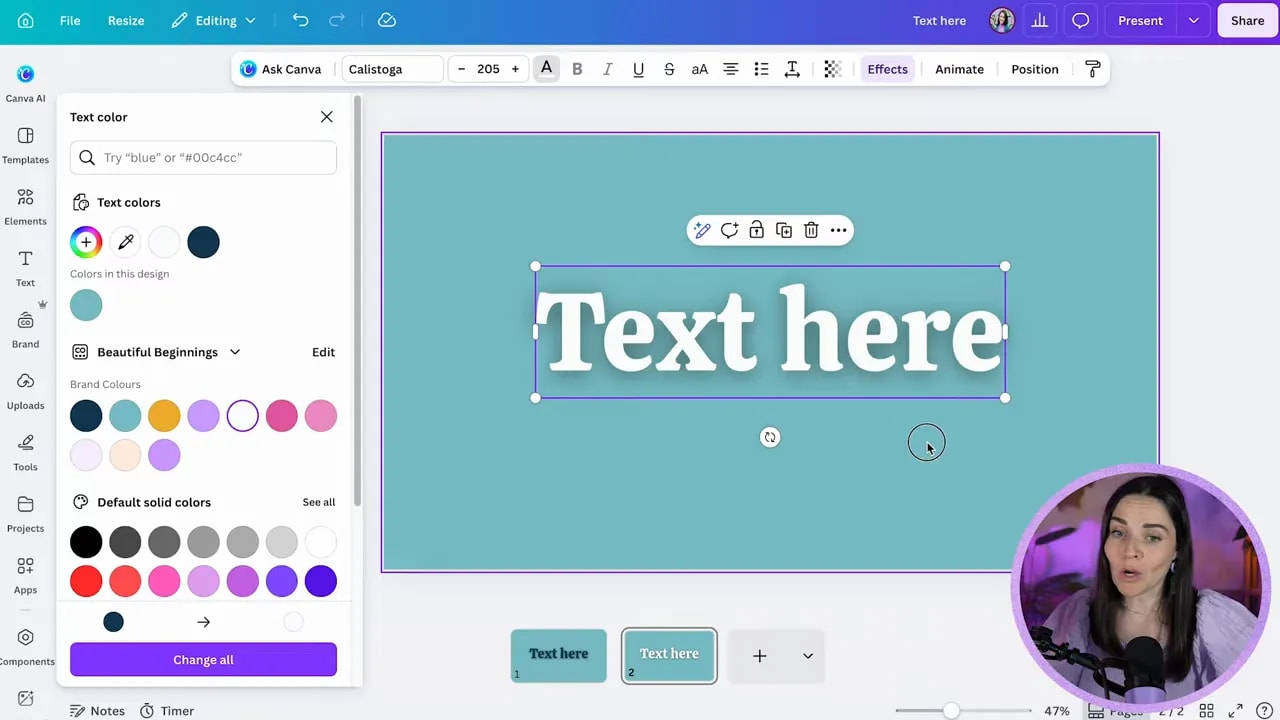
Keep this principle in mind throughout every shadow decision: the shadow is there to create separation and depth, not visual noise.
Step 2: Add a subtle drop shadow to text in Canva
Select your text box, choose Effects, and then choose either Glow or Drop.
Use Glow for quick, reliable text shadows
Glow is a great shortcut when you want a soft, attractive shadow without fiddling with a stack of controls. Although it is labelled Glow, it can give you the gentle drop-shadow effect you are looking for, particularly behind light text.
It is often the best choice when you are moving quickly and simply want the words to pop cleanly from the background.
Use Drop when you need more control
The Drop effect gives you more flexibility, but that also means you can overdo it more easily. The key controls are:
- Transparency: Controls how dark the shadow appears.
- Offset: Controls how far the shadow sits from the text.
- Blur: Controls whether the shadow edge is crisp or soft.
- Colour: Controls the colour of the shadow.
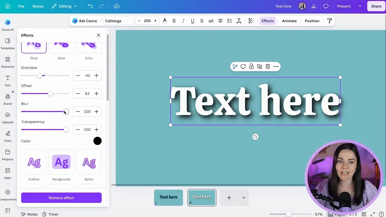
For most brand graphics, keep the offset fairly close, increase the blur so the edge is soft, and lower the shadow intensity so it is barely noticeable. You should feel the depth before you consciously notice the shadow.
A sharp, dark, heavily offset shadow can be a deliberate graphic feature. But that is a specific visual style, not the default setting for every social post, slide, or sales graphic.
As a rule of thumb, use black for shadows. In the real world, a shadow is a variation of black, so a black shadow usually feels more natural and professional. Funky coloured shadows can work as a purposeful effect, but they are no longer functioning like a believable shadow and can quickly make your design feel busy.
Step 3: Apply Canva photo shadows with realistic settings
For a standard image shadow, click the photo, select Edit, scroll to Shadows, choose See all, and then select Drop.
From there, reopen the applied Drop effect to adjust its settings. You will be able to change the blur, angle, distance, and intensity.
Think about the direction of the light source as you adjust the angle. For example, if the light appears to be coming from the top left, the shadow should fall toward the bottom right. You do not need to get overly technical, but the direction should feel consistent rather than random.
For a polished photo shadow:
- Use a soft blur rather than a hard edge.
- Keep the shadow offset noticeable enough to suggest depth, but not dramatically far away.
- Lower the intensity until the image feels lifted, not outlined.
- Resize the photo after editing if the expanded blur changes its visible dimensions.
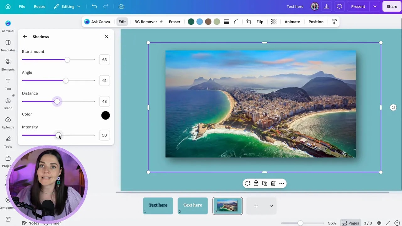
A default photo shadow is absolutely fine for many situations. It gives your image a clean, lifted look with very little work. But there is another approach that can make your graphics feel more intricate and elevated.
Step 4: Create more premium shadows with Canva Elements
The professional trick is to use shadow graphics as separate Canva Elements rather than relying only on the built-in shadow effect.
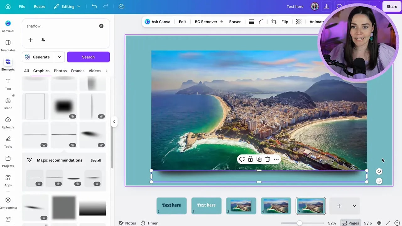
Go to Elements, search for shadow, and look specifically in the Graphics results. You will find lots of shadow shapes, including soft rectangular shadows, curved shadows, oval ground shadows, and more dramatic three-dimensional options.
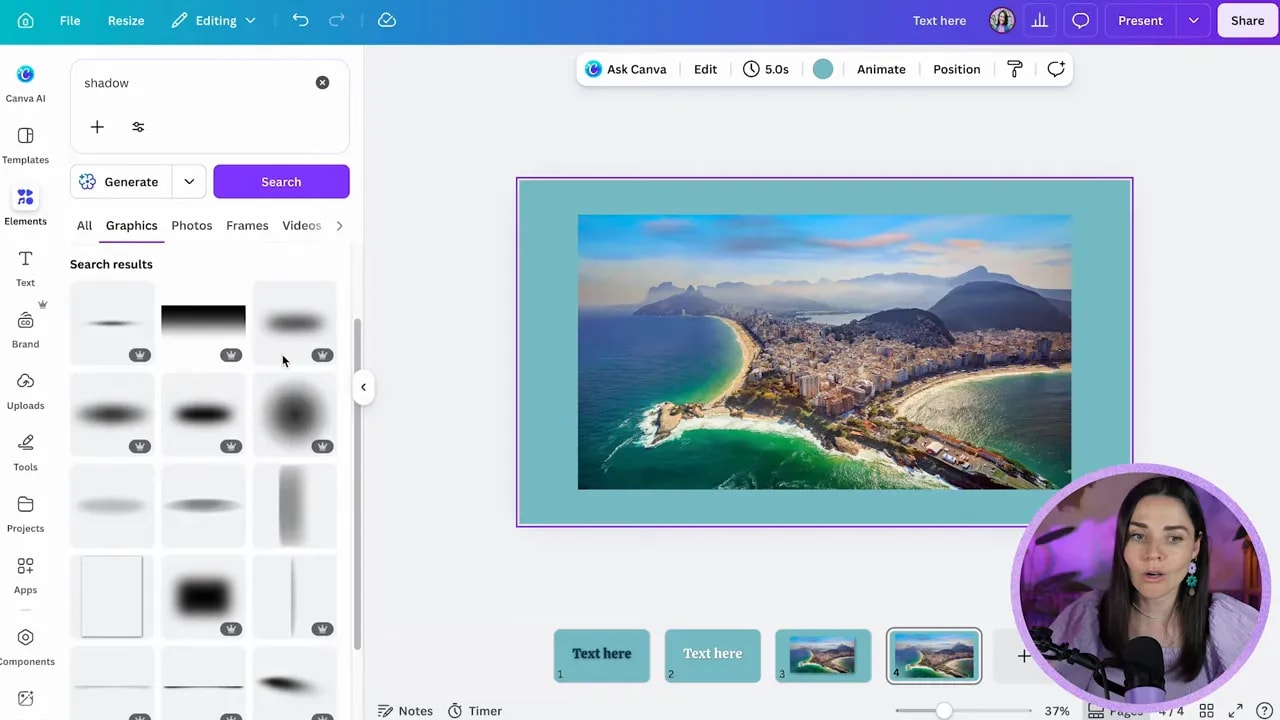
Choose a shadow shape that suits the object you are styling. For a rectangular photo, a rectangular or curved shadow graphic works beautifully. Resize it to match the width of your photo, then place it just underneath.
FREE Design Tools to $100k Masterclass
Grow your biz with clever design and Canva hacks that will save you hours and make you sales.
Some curved shadow elements create the impression that the corners of a photo are floating slightly above the background. It is a subtle detail, but it can look far more considered than a generic drop shadow.
Use Element shadows on boxes, buttons, and text
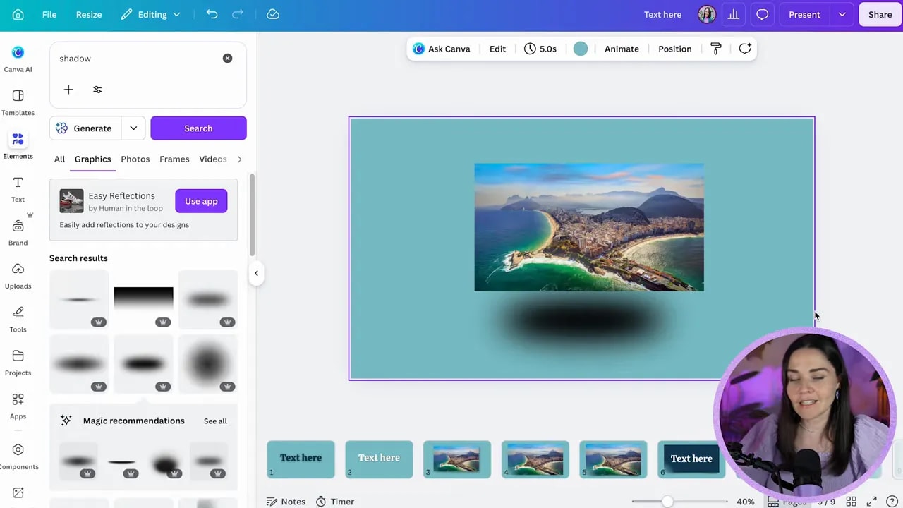
This technique is not only for photos. Place a soft shadow graphic underneath a dark box, button, text block, phone mockup, laptop, or almost any other element. Lower the shadow transparency until it supports the layout without competing with it.
A soft oval beneath text or an image can make it feel as if it is floating above an invisible surface. This gives you depth without applying a visible shadow directly to the object.
Get the layer order right
Your object must always sit above its shadow. The shadow should never cover the photo, person, or object creating it.
If the order is wrong, select the element, choose Position, and either send the shadow backward or use the Layers panel to move it below the object. This one small adjustment makes the design feel logically grounded.
Choose quality over convenience
Not every shadow graphic in Canva will be a winner. Some are too grey, some have harsh cropped edges, and some are simply too strong for a refined brand graphic. Do not assume an element is good just because it appears in the search results.
Look closely for these warning signs:
- The blur is visibly cut off at the edge.
- The shadow is grey rather than a soft black.
- The shape is too harsh or too large for the object.
- The shadow attracts more attention than the content.
If it looks heavy, lower its transparency, scale it down, try another option, or remove it altogether.
Step 5: Add environmental shadows only when they suit your brand
If a design feels a little boring or flat, you can add visual interest with environmental shadow elements. Search terms such as leaf, shadow room, or window shadow can reveal overlays that look like foliage or window light casting across the page.
These can add a lovely atmospheric layer, especially when that relaxed, natural, editorial look aligns with your brand. Keep them subtle and make sure the effect supports the message rather than making the background distracting.
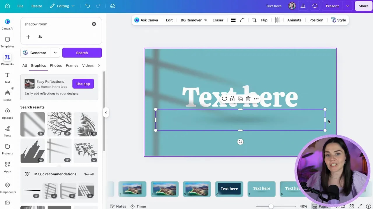
Again, watch the colour. A washed-out grey overlay can look dull rather than dimensional. A softer black shadow with reduced transparency will usually give you a more believable result.
Step 6: Add shadows behind cutout people
When you place a person on a design, begin by removing the background. Then you have two strong options for creating depth.
Option one: Place a separate shadow Element behind the person
Choose an interesting soft shadow graphic, rotate it if needed, place it behind the person, and reduce its transparency. This can help the person pop from the page while still feeling stylish and intentional.
A separate shadow element can be especially effective if you want a more editorial or creative look than a basic drop shadow.
Option two: Use Canva’s built-in Drop shadow
Select the cutout person, go to Edit, find Shadows, and choose Drop. For a natural-looking result, use a stronger blur with low distance and low intensity.
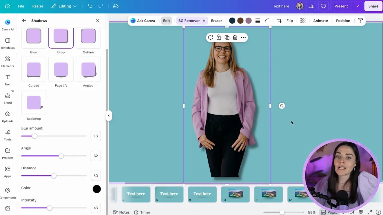
You can, of course, choose a sharp, intense shadow as a deliberately bold style. If you do, make it a conscious creative decision and repeat it consistently. Randomly changing from soft shadows to harsh shadows to colourful shadows will make your brand feel inconsistent.
Step 7: Turn your shadow style into a recognisable brand detail
The most effective design style is the one you repeat. Once you decide whether your brand uses soft black shadows, floating oval shadows, curved photo shadows, or no shadows at all, use that approach consistently across your graphics.
That consistency works alongside your colours, fonts, and layouts to create recognisability and trust. Your designs start to feel like they belong together, which helps your business look established and intentional.
Design is not just about making something pretty. It is about creating graphics that communicate clearly, build trust, and convert.
If you want help building a clear visual brand with the right colours, fonts, design style, and Canva shortcuts, you can join the free Design Tools to $100k masterclass.
Have fun with your Canva shadows, but keep them soft, subtle, and always in service of the design.