
")


Good logo layout makes your brand readable, recognisable, and professional. Use these simple, proven layouts and a handful of logo variations to build a flexible identity that fits on everything from social icons to letterheads. Below are step-by-step layout choices you can apply depending on your business name, icon style, and where the logo will appear.
Table of Contents
- Step 1: Two-line text — large word with a smaller descriptor underneath
- Step 2: One small supporting word above one large name (perfect when your logo contains “the”)
- Step 3: Embed the icon into the word
- Step 4: Icon on top of the text
- Step 5: Icon beside the text (left or right)
- Step 6: Build the six logo variations every brand needs
Step 1: Two-line text — large word with a smaller descriptor underneath
Use this when your business name has a main word or phrase followed by a short descriptor. Examples: “White Deer” with “Graphic Design” underneath, or “Brandy Wine” with “Nursery” beneath it.
Why this works: hierarchy. Making the primary word larger tells the eye where to look first and keeps the mark readable at a glance. Avoid making every word the same size — that confuses the eye.
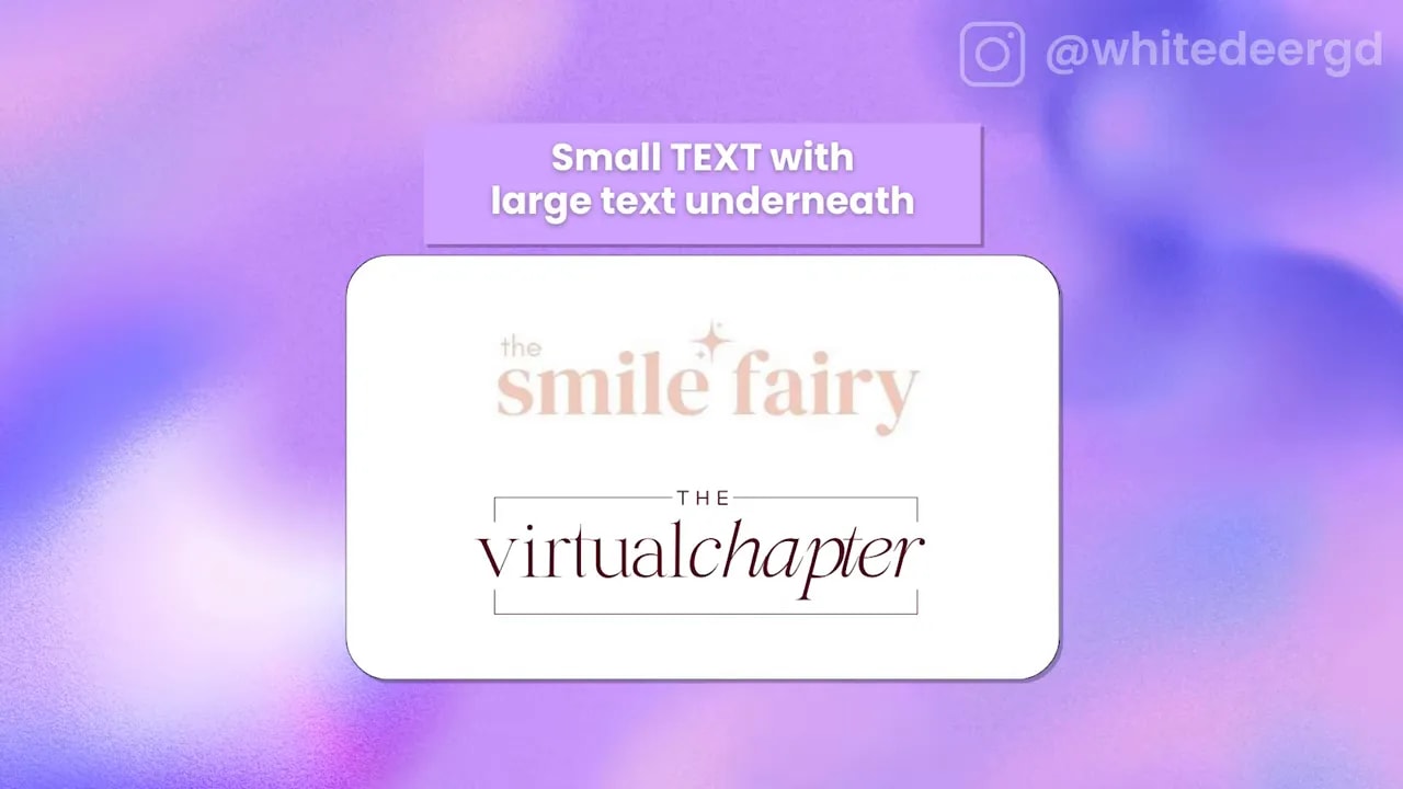
Step 2: One small supporting word above one large name (perfect when your logo contains “the”)
When your name includes a tiny supporting word — like “the” — put that word above as small text and place the actual business name large underneath. This creates visual interest and emphasizes the meaningful part of the name.
Step 3: Embed the icon into the word
If one of your letters naturally lends itself to a graphic, try replacing or embedding an icon directly into the word. Examples include a stylised “O” that becomes a rainbow or a twisted “D” that becomes a plant pot.
Pros: it feels cohesive and unique without requiring a separate symbol. Cons: the icon can be harder to reuse independently. If you plan to use the icon alone often, make sure you also export a standalone version.
Step 4: Icon on top of the text
A classic, durable option. Placing the icon above the wordmark gives you a taller layout that fits narrow spaces (social profile squares, signage, product labels). It also makes the icon very easy to use alone.
FREE Design Tools to $100k Masterclass |
|
Grow your biz with clever design and Canva hacks that will save you hours and make you sales. |
| Get My Free Ticket |
Step 5: Icon beside the text (left or right)
A horizontal or “long” layout places the icon next to the text. This is ideal for headers, footers, or the bottom of stationery where you need a wide, narrow mark.
Decide left or right based on word length and balance. Left is the default because most eyes read left-to-right, but right can work nicely depending on the icon shape and overall flow.
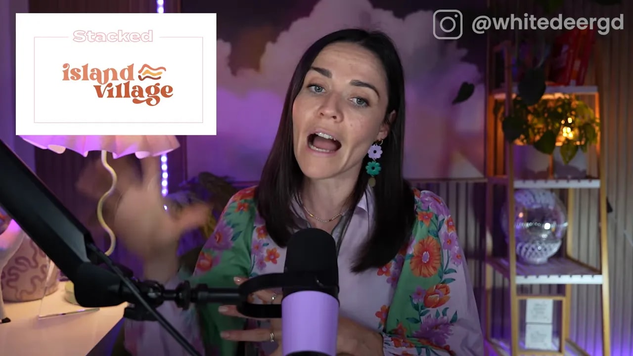
Step 6: Build the six logo variations every brand needs
A single version of your logo won’t cover every real-world use. Export these variations so your brand looks professional in every context:
- Stacked — icon above text or words stacked. Best for narrow but tall spaces and social squares
- Long — icon beside the text or text in one line. Great for letterheads, website headers, and footers.
- Wording — the wordmark alone without the icon. Useful when you need clarity at small sizes or clean printed headers.
- Icon — the symbol alone. Use for favicons, social avatars, app icons, and anywhere the full wordmark would be too small.
- Submark — an abbreviated badge or monogram made from initials or a condensed element of the logo. Excellent for sticker stamps, corner marks, or watermarking.
- Tagline — a version that includes your tagline. Only use when the logo will be large enough for the tagline to remain legible.
Quick practical checklist
- Prioritise hierarchy: choose one primary word or symbol to be most prominent.
- Test legibility: shrink the icon and the wordmark to make sure details remain clear at small sizes.
- Export multiple file types: vector for print, PNGs with transparent backgrounds for web, and square/smaller crops for social avatars.
- Always keep a standalone icon: even if you embed it in the wordmark, have a version you can use separately.
- Avoid over-complicated letter swaps: only replace a letter if the word is common and immediately recognisable.
When to choose which layout
- Short names with descriptors: use the two-line approach (Step 1).
- If your name contains a tiny support word: try the small-over-large trick (Step 2).
- If you want a compact, flexible suite for digital use: prioritise icon, submark, and stacked variations.
- For print headers and website footers: use the long horizontal version.
These layouts are the practical shortcuts designers use over and over because they work. Pick the layout that fits your name and icon, apply your fonts and colours, then export the six variations. You’ll end up with a brand that looks credible, cohesive, and ready for any application.
Try these in Canva or your preferred design tool. Start by creating the stacked and the icon-only versions — they’ll cover most of your everyday needs.
FREE Design Tools to $100k Masterclass |
|
Grow your biz with clever design and Canva hacks that will save you hours and make you sales. |
| Get My Free Ticket |


