
")


If your graphics feel amateur or “meh,” it is usually not because you are incapable. It is because a few small design choices are missing. And your audience will absolutely notice.
Good news: you can fix a lot of that inside Canva using a handful of pro-level tricks that designers use without even thinking.
Table of Contents
- Step 1: Use all caps (and lowercase) for instant text hierarchy
- Step 2: Add subtle shadows to create depth (but do not make them obvious)
- Step 3: Don’t fear alignment and balance. Use asymmetry on purpose.
- Step 4: Layer elements to connect focal points and reduce “busy” clutter
- Final tip (the #1 DIY giveaway): Use max 2 to 3 fonts
- Quick checklist: does your design look pro?
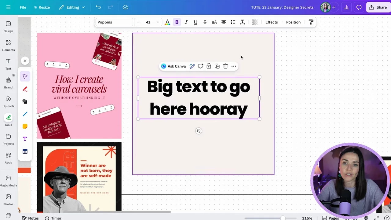
Step 1: Use all caps (and lowercase) for instant text hierarchy
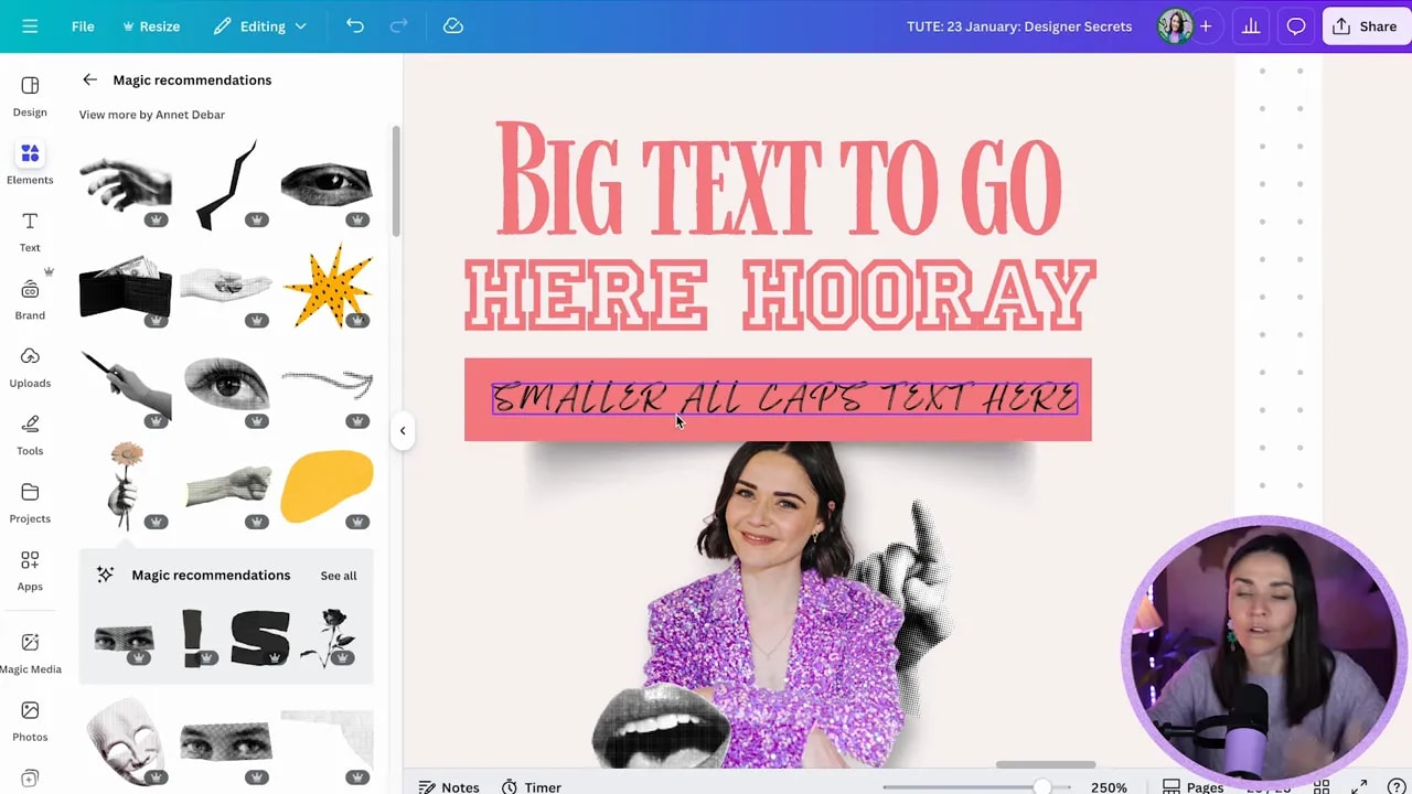
One of the quickest ways to make text look intentional is pairing all caps with lowercase. Sometimes you will even see all caps with letter spacing. That combo creates a clear visual rhythm.
Here are the patterns to copy:
- All caps headline + sentence case or title case supporting text
- Small all caps text in buttons (great for labels and calls to action)
- All caps with spacing for a premium, airy feel
- Quote style: main quote in heavier type, author name in lowercase underneath
What makes this look pro is the contrast.
- Large text versus small text
- Big attention-grabber + smaller supporting details
Step-by-step in Canva (fast)
- Create your main headline with a big size.
- Add a second text box underneath for the supporting line.
- Select the smaller text and toggle uppercase if you want it in all caps.
- Keep the supporting text readable by using sentence case or title case (not everything all caps).
- Optional power move: in Advanced settings, add a little letter spacing to the caps text for a more premium look.
Important: do not do all caps for full sentences or long paragraphs. All caps is inherently harder to read, so keep it to about 3 to 5 words for the “interest” role. Let your readable text carry the message.
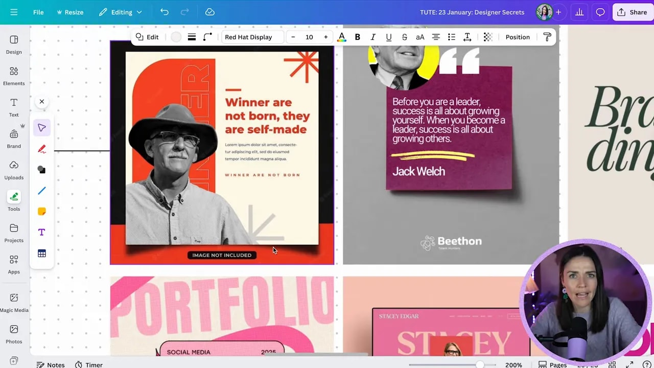
Step 2: Add subtle shadows to create depth (but do not make them obvious)
Flat designs look flat because there is no depth. Designers add depth constantly using shadows. The key is subtle. You should feel it more than you should see it.
If you can clearly notice the shadow and it starts to overpower your layout, it is probably too strong. Lower the opacity until the shadow quietly enhances the design.
How to add a pro shadow in Canva
- Add your shape (or button-like box). Press R for a rectangle and resize it.
- Go to Elements and search shadow.
- Pick a shadow that matches the shape (rectangular shadows for boxes, circular shadows for round elements).
- Because your background may be light, reduce the shadow opacity so it adds depth without becoming the main event.
Shadow options you can explore:
- Cutout/rectangular shadows under boxes
- Circular shadows for softer grounding
- “Floating” shadow setup by placing the shadow slightly offset and lowering opacity
- Different shadow shapes (some create a curved or peeled-edge effect even with the same rectangle)
- Image shadows using Edit shadows and adjusting blur and intensity
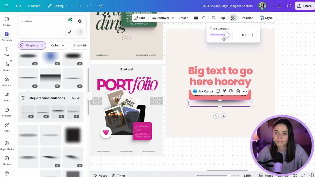
Pro tip: For drop shadows on cut-out images, increase blur and lower intensity so the shadow feels natural, not harsh.
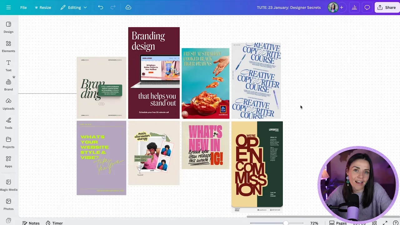
Step 3: Don’t fear alignment and balance. Use asymmetry on purpose.
Most “DIY-looking” designs are boring or awkward because everything is centered or stacked like it is on autopilot.
One hallmark of more pro design is balance without being perfectly centered. None of the examples shared the same exact alignment pattern. Instead, they used different combinations, like:
FREE Design Tools to $100k Masterclass
Grow your biz with clever design and Canva hacks that will save you hours and make you sales.
- Text on the left and a box on the right
- Top-left aligned text paired with a counterweight element lower on the page
- Left text with right-aligned text elsewhere to balance the visual weight
- Center-aligned imagery with non-center aligned text on top (as long as it still feels balanced)
This is not about adding chaos. It is about creating a visual flow so the eye knows where to go next.
When you should keep it centered
Center alignment is not “wrong.” If the asymmetrical balancing feels tricky, you can keep center alignment for the basics and practice variations with time. The point is to avoid robotic layouts.
Step 4: Layer elements to connect focal points and reduce “busy” clutter
Layering is simply placing things on top of other things. It adds depth, visual interest, and helps the design feel connected instead of random.
Layering can be subtle:
- A box underneath with text on top
- A doodle or decorative shape overlapping text (as long as it does not fight readability)
Or it can be more collage-like:
- Text on top of one element, the element on top of another, shadows between layers
- Multiple images stacked so your eye “unpacks” the design as it moves across
How to layer without making it look messy
- Decide your main focal point. That is the star.
- Use layered elements to support that focal point, not steal attention from it.
- Make sure layers help your eye connect where to look next.
- Use layering tools (position and layers) to control what sits behind and what sits in front.
Common mistake to avoid: placing elements at equal “importance” can create multiple focal points and make the design feel disconnected. When the layers connect, it feels more intentional.
Final tip (the #1 DIY giveaway): Use max 2 to 3 fonts
If you only change one thing, change this.
Using too many fonts creates conflicting vibes. Each font is trying to communicate its own personality, and your audience feels that confusion. The result is often less readable, less professional, and harder to trust.
Target: 2 to 3 fonts max across the entire design.
Quick font rules that keep things pro
- Use one font for headlines and one for body text.
- If you add a third, reserve it for tiny labels or very specific design moments (like a badge or button style).
- Choose fonts based on purpose: readability first for body content.
Quick checklist: does your design look pro?
- Text hierarchy uses contrast (big + small) and smart caps/lowercase pairings.
- Shadows are subtle and create depth, not harsh outlines.
- Alignment is balanced, even if it is not perfectly centered.
- Layering connects focal points and adds depth without harming readability.
- Fonts stay under 2 to 3 total.
Steal these design secrets, apply them to your next Canva graphic, and you will feel the difference immediately. Your layouts will look more intentional, more premium, and easier to trust.
FREE Design Tools to $100k Masterclass
Grow your biz with clever design and Canva hacks that will save you hours and make you sales.


