
")


If your graphics feel a little amateur, it is usually not because you lack talent. It is because a few “tiny” design decisions are missing. And once those are missing, people can sense it fast.
The good news? You can fix most of it with repeatable designer moves. No magic. Just proven design fundamentals you can apply right inside Canva.
Use these 4 pro techniques to instantly level up your text, spacing, depth, and layout. Then I will warn you about the #1 DIY mistake that makes designs look unprofessional at a glance.
Table of Contents
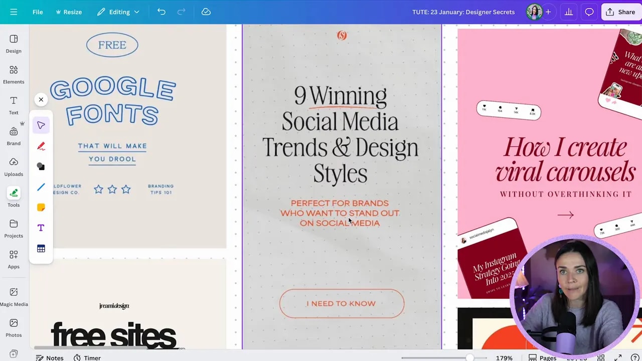
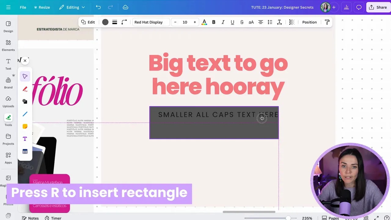
- Step 1: Use ALL CAPS (sparingly) paired with lowercase for instant hierarchy
- Step 2: Add subtle shadows to create depth (and stop “flat” graphics)
- Step 3: Stop default centering. Use alignment and balance for a more “designed” look
- Step 4: Layer elements to connect focal points and stop your design from feeling busy
- PSA: The #1 mistake that screams “DIY” (and how to fix it)
- Use this quick checklist before you publish
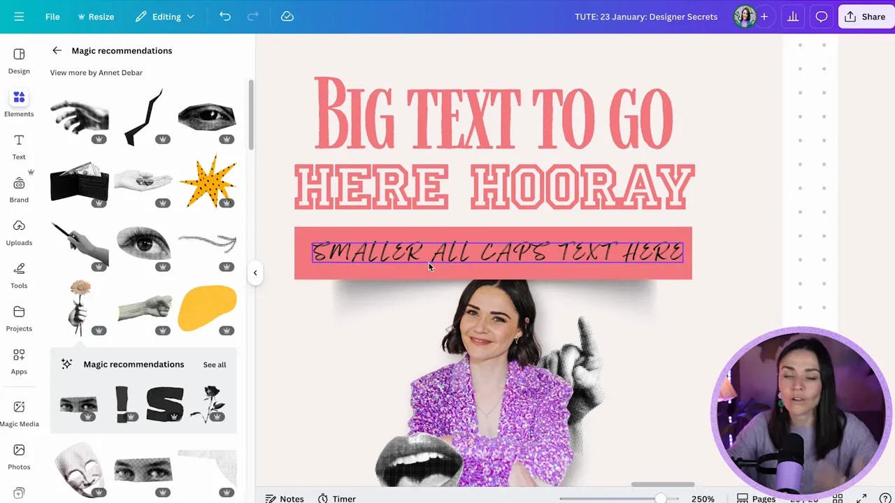
Step 1: Use ALL CAPS (sparingly) paired with lowercase for instant hierarchy
Designers love a specific text combo because it creates contrast and grabs attention without ruining readability.
Try pairing:
- ALL CAPS (often just for a short word or label)
- lowercase or sentence/title case for the main message
Sometimes, designers also add letter spacing to the ALL CAPS text. That extra “air” between letters makes it look intentional and more premium.
How to apply it in Canva (fast)
- Add your main heading in a normal readable case (sentence case or title case).
- Create a second text line for a short label like “SALE”, “NEW”, “LIMITED”, or a button phrase.
- Toggle that label to uppercase.
- If you want it to feel extra designer, open advanced settings and adjust letter spacing slightly.
- Keep the ALL CAPS text to only 3 to 5 words max and avoid using it for full paragraphs. ALL CAPS is harder to read.
Extra designer contrast rule: make sure your sizes contrast. Large text for the main point, smaller text for the supporting label. That “large vs small” rhythm is one of the easiest ways to make something look pro.
Step 2: Add subtle shadows to create depth (and stop “flat” graphics)
Flat designs are one of the fastest ways to make graphics look DIY. Shadows are how you fake depth and make objects feel like they sit on top of the page.
Here is the key: subtle shadows, not obvious ones.
Rule of thumb: if you can consciously see the shadow and it starts overpowering the design, it is probably too strong. Lower the opacity so you feel depth, not drama.
How to add shadows in Canva
- Select your shape, box, or cut-out element.
- Go to Elements and search shadow.
- Pick a shadow style that matches the shape:
- Rectangular or cutout shadow under boxes
- Circular shadow for soft emphasis
- Drop shadow for images and cut-out people
- Adjust transparency to make it subtle (around 33% is a common starting point).
- Position the shadow behind the object using Canva’s layering controls.
You can also use different shadow shapes to create interesting effects. For example, some curved shadows can make edges feel like they are peeling or curling, even if the element is still a plain rectangle.
Step 3: Stop default centering. Use alignment and balance for a more “designed” look
Here is a big pro tip: everything does not need to be centered to look polished.
Many amateur designs stack elements in the obvious way (text centered, box centered, done). Pro layouts play with balance instead.
FREE Design Tools to $100k Masterclass
Grow your biz with clever design and Canva hacks that will save you hours and make you sales.
What you are aiming for is intentional asymmetry. That means elements are not always lined up perfectly in the middle, but they still feel stable.
Practical alignment patterns to try
- Text on one side, box on the other (instead of text on top, box underneath, both centered)
- Left-aligned text balanced by something on the right (like a graphic or image)
- Top or left aligned text balanced by spacing or weight elsewhere
- Different alignment for different sections (as long as something pulls the eye both directions)
If your layout feels “off” when you stop centering, that is usually because the balance is missing. Add visual weight on the side you need (a darker block, a larger element, or an image) to compensate.
Quick comfort note: this gets easier with practice. If advanced balance feels tricky, keep center alignment for now, but gradually tweak one section at a time.
Step 4: Layer elements to connect focal points and stop your design from feeling busy
Layering is simply placing elements on top of each other. But when it is done intentionally, it does something amazing: it helps your eye understand what matters and makes the whole composition feel connected.
Layering can be subtle, like:
- a box behind text
- a small element overlapping a headline
- a shadow behind a mockup
Or it can be bold and collage-like with many overlapping layers. Either way, the principle is the same: layers should support the main focal point.
How to layer without making it messy
- Decide your main focal point (usually your face, logo, product, or headline).
- Layer background elements behind the focal point.
- Add small overlapping accents that support the story (not random decoration).
- Keep the focal point visually dominant:
- it should be the clearest
- it should be the highest contrast
- it should sit on top of the right layers
- Use positioning and layers to move elements up and down until the layout “clicks.”
A helpful way to think about it: when things do not connect, they look like separate parts. Layering helps them become a single composition.
PSA: The #1 mistake that screams “DIY” (and how to fix it)
If you only fix one thing, fix this.
Using too many fonts.
Even if your design is visually interesting, too many fonts creates conflicting “personalities.” Each font is trying to communicate something different, and your audience reads it as confusing, less credible, and less professional.
Fix it immediately
- Pick max 2 to 3 fonts total.
- Make one font do headings and another do body/labels (or one font for the brand look plus one functional readable font).
- If readability is suffering, reduce font variety and simplify your hierarchy first.
Design rule that saves you: if your brand is trying to say too many things at once, it will confuse your audience. Typography clarity makes your message feel trustworthy.
Use this quick checklist before you publish
- Text hierarchy: large type for the main message, smaller type for labels
- Case contrast: ALL CAPS (sparingly) + lowercase/sentence case for readability
- Depth: subtle shadows on boxes, mockups, and cut-out images
- Balance: not everything centered, but still visually stable
- Layering: overlap elements to connect your focal points
- Typography: max 2 to 3 fonts
If you apply only one of these today, start with font limits and subtle shadows. Those two alone can make an “almost there” Canva design feel instantly more intentional and pro.
FREE Design Tools to $100k Masterclass
Grow your biz with clever design and Canva hacks that will save you hours and make you sales.


