Turn your brand and graphics into a client magnet with the FREE bingable 3x video series.
Grab your freebie!
Blog Categories
Canva, branding, design, marketing and empowering women in business!
Hi, I'm Jacqui! The girl who fell in love with design and business.
Listen on Apple • Listen on Spotify
Are you ready to level up your Instagram game and turn random people stumbling across your Instagram into dedicated followers and buyers? Well buckle up, because we’re diving into the secret sauce of creating a killer Instagram presence!
Instagram has become the go-to platform for businesses and individuals to show off their brand and reach more peeps. But let’s face it, with so much content out there, it can be tough to stand out and make a lasting impression. But don’t you worry, we’ve got you covered! In this episode/post, I’m spilling the tea on the design and strategy tips that will take your Instagram presence to the next level. Get ready to become an Instagram pro in no time!
The overall question you need to ask yourself throughout all of this is: What would someone stumbling across my feed for the first time think? What can they tell about me and my business from a quick glance?
NUMBER 1: CONSISTENCY
First things first, let’s talk about the power of a killer aesthetic. Think of it like a super cool outfit that you wear every day to show off your personal style. On Instagram (and in business as a whole!) your aesthetic is made up of the colours, fonts, graphic style and images you use. The goal is to have a look that aligns with your brand and speaks to your audience and to use that same look OVER AND OVER so your followers begin to recognise you, build loyalty and connection. Plus, having a consistent look is a key way to look like a trust brand. Stick with what works and watch your followers swoon.
NUMBER 2: VARIED DESIGN and CONTENT
Now, let’s talk about the main event: creating content that will make your followers’ hearts sing. It’s not enough to just post anything – you’ve got to take the time to plan and create posts that are not only visually appealing, but also aligned with your brand… but not repetitive.
Think about it, who wants to see the same thing over and over again? BOR-ING! Instead, throw in a variety of content such as tips, some boss-level biz advice, quotes, testimonials, showcasing your offers and sharing YOU. Keep things relevant to your brand but varied in its topic, purpose and point. Doing this will automatically help you to create varied designs which results in a grid that appears dynamic, interesting and worthy of hitting “FOLLOW”.
NUMBER 3: BIO AND DISPLAY PICTURE
Next up, we’ve got the art of crafting a profile description that will leave your followers saying, “Whoa, this person knows what’s up.”
My number 1 tip for personal brands is to feature YOU in your bio image. People love connecting with PEOPLE, not just a faceless business.
Here are a couple of pointers:
- Use a well lit, crisp image of you (ideally a professional headshot)
- Make sure we can see your EYES (remember display pics are usually displayed very small)
- Experiment with adding your branding to the photo – can you change out the background for your brand colour or add in a cute element or two
- DON’T change it up too much. This photo is one of the quickest things people will use to recognise you on stories and as they scroll their feed – make sure you don’t alienate them by changing too regularly.
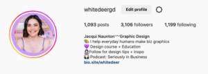
And now fo the text! You profile description should be crystal clear about what you do, who you help, and why someone should hit that follow button. And don’t forget the call-to-action! You can see an example of mine above.
And that, my friends, is how you create a strong and effective brand on Instagram! By following these best practices, you’ll be able to reach your target audience, build a connection with them, and grow your business. So go forth, be playful, and have a little fun with it – let your unique brand shine through.
Liked this blog post? We have only just scratched the surface!
Follow me on Instagram at @whitedeergd or join DIY Design My Biz here.
If you loved this episode as much as I loved sharing it with you…there is more where that came from!
-
Be sure to subscribe so you don’t miss out on future juicy design hacks. For bonus points and a little “eeeek” from me as I sit on the other end – I would LOVE if you would leave a review and rating. It’s a little thing that makes a big difference and helps me continue to produce more DIY goodness for you!