











Listen on Apple • Listen On Spotify
You’ve built the brand. You’re posting consistently. The graphics look polished and professional… and yet the enquiries aren’t coming in the way you’d hoped. People save and like things, but they don’t reach out.
If that’s you, here’s what’s worth considering: there’s a real difference between graphics that look good and graphics that sell. And for a lot of business owners, that gap is the reason things feel stuck.
In this blog, I break down what actually makes a graphic convert… and what you can start doing differently today.
The Prettiest Graphics Aren’t Always the Ones That Sell
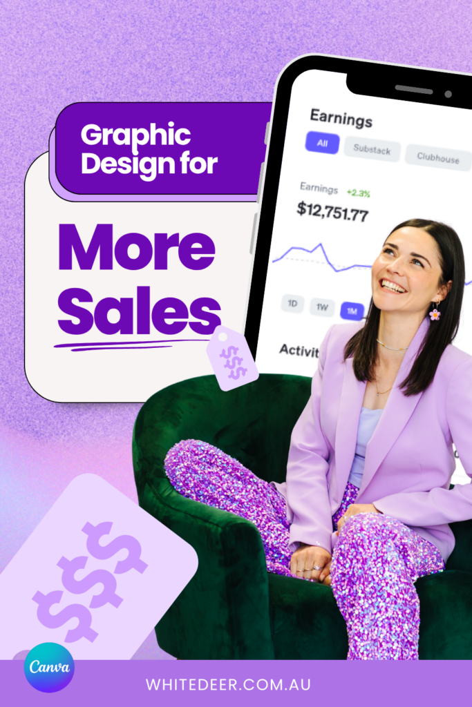
Here’s something that’s a little uncomfortable to hear from a graphic designer: some of my least pretty posts are the ones that get the most traction for my business.
That’s because design isn’t about looking beautiful. It’s about being clear. A converting graphic gives your audience one thing to look at, one thing to read, and one clear action to take. It’s not trying to say three things at once or cram everything in.
It’s strategic above everything else.
So before you add another element or another line of text, ask yourself: does this make my message clearer, or does it just make it prettier? If the answer is the latter, it might not be worth including.
Four Psychological Tools to Stop the Scroll
Everyone’s brain is wired relatively similarly, and there are specific visual cues that naturally draw attention. You don’t need to use all of these… pick what’s relevant to your graphic and your audience.
1. Contrast
Our eyes go to the biggest, brightest, boldest thing first. That doesn’t mean fluorescent colours, it means making sure the most important element in your design stands out clearly from everything else. Dark text on a light background, light text on dark. And contrast with sizing too: pair very large text with smaller supporting text so there’s a clear visual hierarchy and nothing is fighting for attention.
2. Eye contact
Whether it’s a video or a static graphic, a photo of you actually looking at the camera makes a difference. Our human eyes are always seeking other humans to connect with, and including yourself in your content in a way where you’re looking directly into the camera creates connection.
3. Bold singular statements
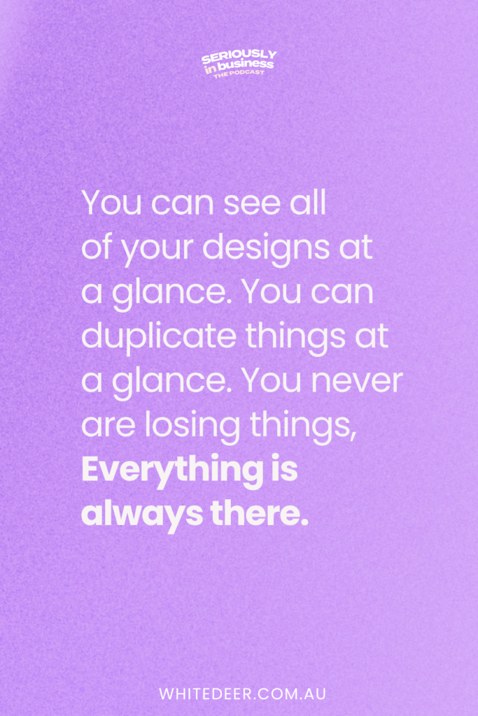
A single, large, impactful line of text, like a quote or a core message, can cut through a busy feed. Think of those simple quote-style graphics that feel like a pattern break from all the polished, busy content around them.
4. Before and after framing
If your product or service creates a visible transformation, show it. Whether that’s a visual before and after, or a written one… “before working with me, after working with me”… this kind of framing helps your audience put themselves in the story and understand how you can help them.
Your Graphic Is One Part of the Sales Sequence, Not All of It
A lot of business owners put enormous pressure on a single graphic to do the entire selling job. And when a beautifully designed post doesn’t immediately bring in clients, it’s easy to spiral into thinking design doesn’t work.
But your graphic isn’t the full sales sequence. It’s one piece of it. Its job is to capture attention, signal that you’re professional, and create enough connection that someone wants to keep reading. After that, it’s the copy… what they read in your caption, on your website, in your emails… that does the heavier lifting.
If the copy isn’t connecting, great design won’t cover for it. And if the design is cluttered or confusing, great copy might not even get read. They work together.
I also create multiple different graphics for different points in the sequence, from cold audience awareness right through to the purchase moment. It’s not one graphic and done. It’s an ongoing, layered approach.
Four Questions to Audit Every Graphic Before You Post
Before publishing anything, I recommend running through these four questions:
1. Is what you’re trying to say immediately clear?
Not after 10 seconds of deciphering. In two seconds… can someone glance at your graphic and understand the key message?
2. Is it clear who this is for?
Your content isn’t meant to speak to everyone, and that’s a good thing. Does your graphic signal, through style, context, or copy, who you’re talking to? Someone should be able to tell within a glance whether this is speaking to them or not.
3. Is there a clear call to action?
What do you want someone to do after seeing this? Follow, comment, click the link in bio, send a DM? Pick one. Giving too many options leads to overwhelm and inaction.
4. Does this feel consistent with everything else you’re putting out?
Inconsistency confuses audiences. If every graphic looks different, people struggle to connect it back to you and can’t build the trust that leads to purchases. Consistency builds recognition, and recognition builds trust.
These four questions will catch the small things that are stopping your graphics from working.
What to Do Next
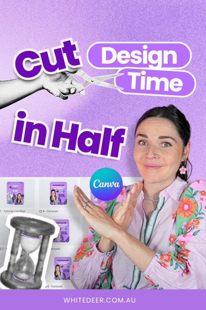
If this episode has you thinking differently about your design, the next step is my free Design Tools to 100K masterclass. You’ll get the three biggest design mistakes I’m seeing business owners make right now, Canva templates that are strategic and simple, and a live demonstration to show you how to use them.
Free Canva Masterclass: Design Tools to $100k 👉
https://www.whitedeer.com.au/designmasterclass
WORK WITH JACQUI:
// DIY Design My Biz: The best course for business owners DIYing their own brand and graphics in Canva. Learn more: https://whitedeer.com.au/diy-dmb
// The Co+Creation Design Club: Design WITH the help of a professional designer in this high-touch coaching space: https://whitedeer.com.au/designclub
// Design Studio: If you’re after fully done-for-you design services my studio team can help! https://whitedeer.com.au/designstudio