












Listen on Apple • Listen On Spotify
You’re doing everything right. You’ve got a great offer. Your copy is solid. You show up consistently. So why does it feel like the people you actually want to work with just… aren’t coming?
Before you overhaul your pricing or your entire content strategy, there’s something worth considering first. Something a lot of business owners overlook entirely, and it might be the thing that’s getting in the way of all that hard work actually landing.
It’s your visual brand.
Your Visual Brand is the First Thing Your Audience Sees
We like to think that people are reading our posts, landing on our website, looking at our flyer, and really taking it all in. But here’s what’s actually happening: they’re deciding in a split second whether what they’re seeing is for them. And then, if it is, they’ll read.
We are visual creatures. We process what we see before we process what we read. Which means if your visual brand, your colours, your fonts, your overall graphic style… isn’t connecting with your ideal client, they’re not sticking around long enough to see how brilliant your offer is.
This is why business owners who have genuinely great services and incredibly helpful content can still struggle to grow. The visuals are working against them. Not dramatically. Not in a way anyone would ever say out loud. But at a subconscious level, your audience is seeing your graphics and deciding: this isn’t for me.
What a Visual Brand Actually Is
Most business owners start with a logo and consider the job done. But when did you last actually see my logo? Probably not recently. What you see are my Instagram posts, podcast covers, email headers and YouTube thumbnails.
That is my brand.
Your visual brand is:
- The colours you use consistently
- The fonts you’ve chosen
- The overall graphic style… whether that’s minimal, illustrative, collage-inspired, bold and editorial, or somewhere in between
- The elements and textures that show up across everything you put out
This collection of choices communicates at a glance what your business is about, who you’re for, and roughly what your price point is. It signals your professionalism before a single word is read.
If you don’t have these choices locked in, you’re essentially making branding decisions on the fly every time you create a graphic. And what gets put out into the world becomes a mix of random aesthetic choices that don’t actually reflect who you are or speak to the person you want to attract.
What Clients Actually Buy From You Before They Look at Your Offer
Think about the last time you almost bought something and hesitated. Chances are, there was something that felt slightly off. Maybe the website looked a little dated. Maybe the graphics felt inconsistent. Maybe something just didn’t quite add up.
That’s your brain doing exactly what it’s designed to do… protecting you by looking for signals that a business can be trusted.
Your potential clients are doing the same thing when they look at your Instagram, your flyer, your website. They’re not consciously thinking, “That font choice is a concern.”
But subconsciously, they’re deciding whether you’re the kind of business they can hand their hard-earned money to.
Professional, consistent, strategic design signals: yes, this is a real business. This person knows what they’re doing. I can trust this.
Amateur, inconsistent, or visually unclear design signals the opposite. Even if everything else about you is incredible.
This is why investing time in your visual brand isn’t vanity. It’s not just about looking pretty. Every graphic you put out is either building trust or eroding it.
The Silent Brand Killer
Imagine someone follows you on Instagram. Today you post something in soft blue with a cursive font. Tomorrow, black and gold with geometric elements. The day after, a white graphic with purple text.
They can’t form a connection with you, because there’s nothing consistent to connect with. They also can’t tell what your business is actually about, because the visuals aren’t communicating anything clear. And so they just… keep scrolling.
Consistency in your branding does two things: it makes you recognisable, and it lets your graphics do the job of communicating who you are and who you’re for without you having to spell it out every time.
The fix here often isn’t a full rebrand. Sometimes you just need to sit down and commit to what you’ve already been drifting toward. Pick a consistent colour palette. Lock in the fonts. Decide on a style. Then apply it every time.
That said, having a beautiful brand is only half the picture. If you don’t know how to use design principles, like hierarchy, white space, contrast, you can still undermine the whole thing every time you go to create a graphic. Which is exactly why I built my free masterclass, Design Tools to Get to 100K Online.
Brand Fixes You Can Do Right Now to Look Like a $100K Brand
Here’s where to begin if your brand isn’t reflecting where you’re at right now:
Audit what you’ve been using: Look at your last 12 posts. Are there colours and fonts that keep showing up? That’s the start of something you can commit to.
Document your choices: What are your 3–4 brand colours? What are your two fonts? Write it down somewhere you’ll actually use.
Learn a few design principles: Understanding how hierarchy and white space work will change how your graphics land.
If you want to learn exactly how to do this, my free masterclass is the perfect starting point. I cover the design mistakes that make brands look DIY and amateur, including a live Canva demonstration, and share keyboard shortcuts that will save you hours.
Free Canva Masterclass: Design Tools to $100k
👉 https://www.whitedeer.com.au/designmasterclass
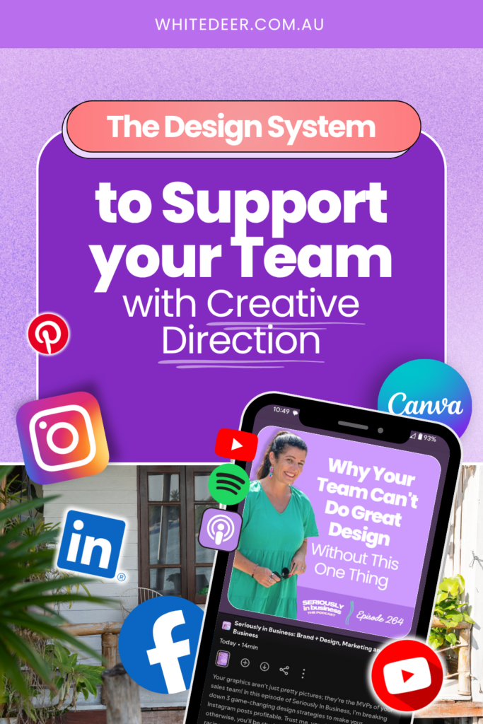
WORK WITH JACQUI:
// DIY Design My Biz: The best course for business owners DIYing their own brand and graphics in Canva. Learn more: https://whitedeer.com.au/diy-dmb
// The Co+Creation Design Club: Design WITH the help of a professional designer in this high-touch coaching space: https://whitedeer.com.au/designclub
// Design Studio: If you’re after fully done-for-you design services my studio team can help! https://whitedeer.com.au/designstudio