
")


Listen on Apple • Listen On Spotify
I’m thrilled to have you here as we dive into a topic that’s close to my designer heart – embracing a minimalist mindset for your DIY designs.
If you’ve ever found yourself adding just “one more element” or struggling to pick the right font among a billion choices on Canva, you’re not alone. But as it turns out, less is more, especially in design. So, let’s chat about how you can create impactful and efficient graphics for your business without overdoing it.
Cut Back on Instagram Overdesigning
Let’s start with Instagram. It’s a bustling platform where authenticity often trumps perfection. You’ve probably felt the pressure to create intricately designed stories and reel covers, right? Well, here’s your permission slip: Your audience craves authenticity, especially in Instagram Stories. So, don’t stress about going all out on every single story. Instead, use consistent fonts directly in your Instagram app and stick to colours that echo your brand.

And for those reel covers? Skip the Canva hop. Grab a screenshot from your video, slap on some branded text, and call it a day. It’s faster, genuine, and surprisingly effective in connecting with your audience.
Avoid Overcrowding Your Designs
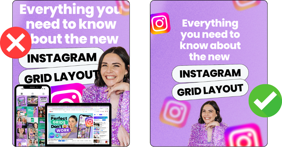
Now, on to one of the most common DIY traps: overcrowding. We’ve all been there–adding an extra icon here, a pinch of colour there, convincing ourselves it’ll make our designs ‘pop’. But let me tell you, too much pizzazz might just backfire, turning your carefully crafted graphics into an eyesore.
When you’re layering elements on a design, ask yourself: Does this add value to my message? Remember, the goal is communication, not just decoration. Keep your main text as the star, and let everything else play a supportive role. Overcrowding leads not just to confusion but to an overwhelming vibe that risks pushing your audience away. Keep it simple, and let your designs breathe.
Consistency is Your BFF
Next up, let’s talk consistency. Ever suffer from shiny object syndrome? You find a new template, colour, or font and think, “Ooh, that’s cute!” The temptation is real. But hopping from style to style can make your brand look less cohesive and more like a patchwork quilt.
Stick to a select set of fonts and colours – like a personal uniform for your brand. This not only streamlines your design process but also amps up the professionalism and recognisability of your business. Your designs will feel like a tight-knit family, not distant cousins.
Font Finesse
Okay, let’s chat fonts. Oh, the agony of choices in Canva! When it comes to fonts, less is definitely more. Commit to a maximum of three – maybe a primary font for headings, a secondary for subtext, and an accent font for a little flair. This helps maintain a tidy, coherent look across all your designs. As fun as it might be to experiment, your consistency is key to unlocking a polished aesthetic.

Strategic Simplicity
Lastly, focus on engaging and purposeful content. Surprise! You don’t have to post every day. Concentrate your efforts on high-quality posts that resonate with your audience, like Instagram carousels or reels. Reuse templates, hone in on content that drives engagement, and keep your call-to-action clear and singular.
Simplicity can also be used in our text – make sure your words are legible and visually appealing. Play with text size to create contrast and intrigue without the need for clutter. Your viewer’s eye should glide through the content effortlessly, leading naturally to a clear and deliberate action.

The Space to Breathe
Don’t underestimate the power of white space. It offers room for the eye to rest and brings a sense of calm and professionalism to your designs. If it feels uncomfortable at first, trust the process. White space helps your important elements shine without the chaos of over-densified layouts.
And there you have it! I hope these insights help you look at design through a new lens. Less over-designing means saving time and energy, making your messages more impactful. Stick around for more tips, and remember: the best design is one that speaks without shouting. Cheers to designing with intention!
Make sure to watch the full video above to see even more tips to help you embrace simpler design that saves you time and gives you a bigger impact.
PLUS if you’re eager to put these strategies into practice and explore even more design magic, I’m inviting you to join my free design masterclass:

‘Design Tools to Get to $100k+ Online in 2025.’
Inside, I’ll walk you through:
✅ The templates you need to save time.
✅ How to create high-converting graphics that grow your business.
✅ Smart design hacks to eliminate overwhelm.
Save your seat: www.whitedeer.com.au/designmasterclass
WORK WITH JACQUI:
// DIY Design My Biz: The best course for business owners DIYing their own brand and graphics in Canva. Learn more: https://whitedeer.com.au/diy-dmb
// The Co+Creation Design Club: Design WITH the help of a professional designer in this high-touch coaching space: https://whitedeer.com.au/designclub
// Design Studio: If you’re after fully done-for-you design services my studio team can help! https://whitedeer.com.au/designstudio


