Turn your brand and graphics into a client magnet with the FREE bingable 3x video series.
Grab your freebie!
Blog Categories
Canva, branding, design, marketing and empowering women in business!
Hi, I'm Jacqui! The girl who fell in love with design and business.
Listen on Apple • Listen On Spotify
Let’s face it, navigating the world of Instagram can feel a bit like being a gladiator in a tech coliseum. And if your posts aren’t turning heads, then brace yourself; you might already be losing the battle. But fear not! I’m here to arm you with foolproof design hacks to make sure your content not only gets noticed but also gets that all-important engagement. So, let’s dive right in!
The Importance of Simplicity
Keep it Simple, Silly (You’re not silly, but I did love the alliteration)!
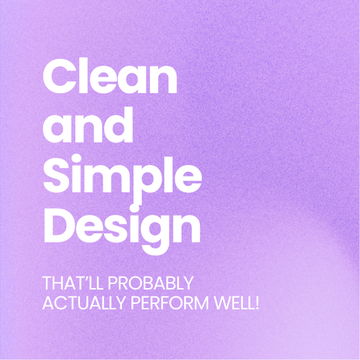
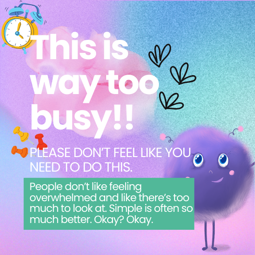
One of the biggest mistakes I see entrepreneurs making is over-designing their posts. You see, adding too many elements can make your design look cluttered and, quite frankly, exhausting to look at. Instead, focus on simplicity. When your design is straightforward, it’s easier for your audience to grasp your message in a nanosecond, and that’s exactly what you want.
In Canva, it’s tempting to go crazy with intricate templates and countless design elements. But before you add that 547th icon, ask yourself: is this necessary? Chances are, it’s not. Even a little texture or gradient in the background can do wonders without overwhelming the viewer. So, let’s simplify!


The Magic of Hierarchy
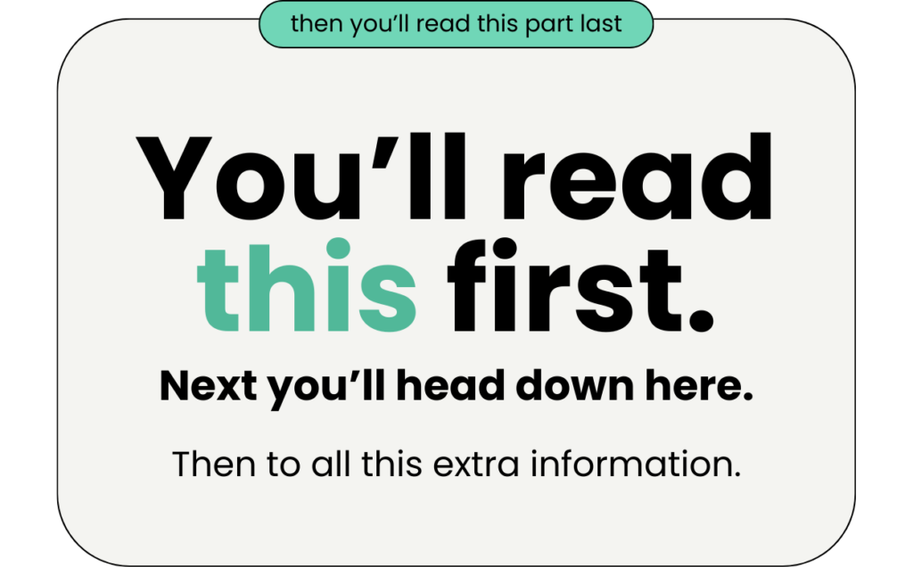
Simplicity doesn’t mean boring; it means strategic. Enter the concept of hierarchy. This is like the GPS for your viewer’s eyes. By using different sizes of text, you guide your audience on a visual journey from your eye-grabbing headline to the fine print that seals the deal.

For the love of good design, don’t make all your text the same size. Yes, even if it’s really tempting! A heading that’s size 50 versus body text that’s size 20 speaks volumes—literally and figuratively. Large text captures attention, and smaller text provides the details. Remember, contrast is your best friend here. Play with it and make sure that your texts have enough drama to demand attention.


Accessibility is Key
High Contrast for the Win
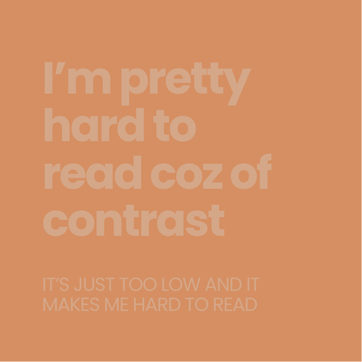
Instagram is a visual platform, but let’s not forget accessibility. If your design isn’t easily readable, especially for those with poor eyesight, it won’t stand a chance. High contrast is the cornerstone of accessible design. Think black text on a white background or dark on light, not light brown on medium brown—save those artistic choices for your next pottery class.
When experimenting with colors, ensure there’s a significant difference between your text and background hues. This makes your content not only eye-catching but also inclusive.

Easy Does It
Your audience doesn’t want to solve a Rubik’s cube when reading your post. Ease of reading is crucial. Keep your font sizes large enough to be readable without squinting but not so giant that it looks like a banner ad. Simplify your message, spread it out over multiple posts or carousels if necessary, but don’t overload one post.
Leveraging Personal Branding
Say Cheese!
If you’ve built a personal brand, don’t shy away from using your own photos. People connect with people, and showing your face can make your brand more relatable. While you don’t need to make every post a selfie, sprinkling images of yourself here and there can create a stronger connection with your audience.
Insights and Analytics
Now, what kind of expert would I be if I didn’t encourage you to check your analytics? Take a dive into your highest-performing posts and analyze why they’re doing well. Is it the large text? The visuals? The simplicity? Most likely, it’s a combination of these foolproof design strategies.
Conclusion: Time to Stand Out
Armed with these tips, you’re now ready to make your Instagram posts scroll-stopping masterpieces. Simplify your designs, use hierarchy to your advantage, ensure accessibility, and don’t forget to sprinkle in some personal touches. And hey, if you try these tips, tag me @whitedeergd. I’d love to see your new and improved posts, and who knows? I might even share them. Remember, Instagram is a battlefield, but with the right strategies, your brand will emerge victorious.
Tune in next time, where I’ll share how to turn these eye-catching designs into profit. Until then, happy designing!keep showing up, and remember: you’ve got this!
See you in the next episode, and hey, if this resonated with you, let’s chat more on Instagram @whitedeergd for all the latest tips and strategies. Happy branding!
Are you a 6-figure business owner ready to stop feeling stuck and start creating a brand that truly reflects the powerhouse business you’re building. I can’t wait to welcome you into The Co+Creation Design Club and help you make your million-dollar brand a reality.https://whitedeer.com.au/designclub
OR if you’re in those early stages of business and need some more affordable support that will get your branding started from the ground up join us in DIY Design My Biz! https://whitedeer.com.au/diy-dmb
If you loved this episode as much as I loved sharing it with you…there is more where that came from!
- Be sure to subscribe so you don’t miss out on future juicy design hacks. For bonus points and a little “eeeek” from me as I sit on the other end – I would LOVE if you would leave a review and rating. It’s a little thing that makes a big difference and helps me continue to produce more DIY goodness for you!