Turn your brand and graphics into a client magnet with the FREE bingable 3x video series.
Grab your freebie!
Blog Categories
Canva, branding, design, marketing and empowering women in business!
Hi, I'm Jacqui! The girl who fell in love with design and business.
We only get one chance to make a great first impression… a chance for people to say YES to hitting that follow button, or to leave our page maybe forever.
Here are my top tips to creating a follow-worthy IG grid using the power of strategic design.
1. Putting on the Lens of a Stranger:
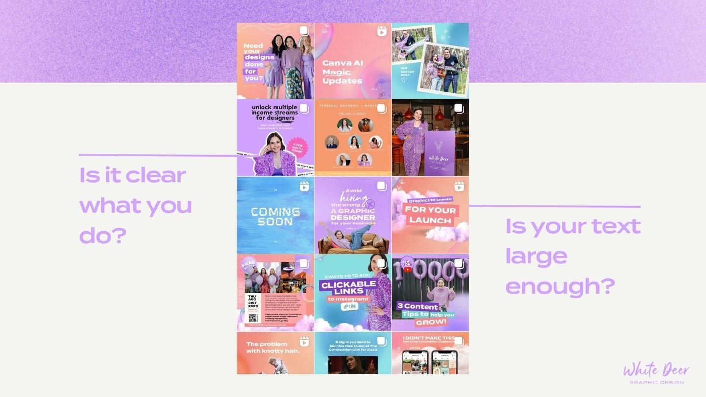
When someone stumbles upon your Instagram page, it’s crucial to think like a stranger. Consider how they found you—was it through a recommendation, word-of-mouth, or a reel that caught their attention? To captivate potential followers, you need to ensure that your page clearly communicates what you do and who you serve. Take a moment to analyze your own page from an outsider’s perspective. Is your niche apparent? Do your posts tell a story? Make it crystal clear why someone should click that “follow” button!
2. The Power of Visuals:
Your posts aren’t just about providing value, sharing your expertise or advertising a service. They also can be designed in a way that shares why someone should follow you when they first arrive on your page. The best way to do this? USE LARGE TEXT for the main point of you post. Sharing 5 tips on shiny hair? Make that text large so that when someone views your post inside your grid they can see that text WITHOUT having to tap on your post. If at least 50% of your posts have their message clear from a zoomed back view in your grid than a stranger can see what value they’ll get from you at a glance!
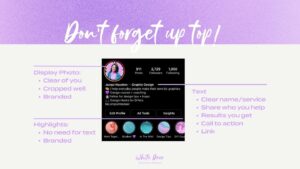
3. Designing a Strategic Bio:
Your bio is like a virtual business card—it introduces you to potential followers and outlines what they can expect from your content. Craft a concise and compelling bio that highlights your expertise, target audience, and unique value proposition. Remember, it’s not just about a clever tagline, but also about providing a glimpse into your world. Show them why they should stick around and soak up your Instagram goodness.
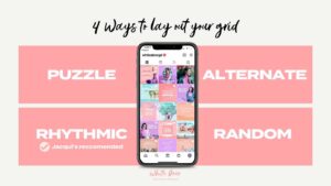
4. Crafting a Beautiful Grid: While aesthetics are important, your Instagram grid is more than just a pretty face. It’s an opportunity to showcase your brand’s essence and create an enticing visual experience for your audience. Experiment with different grid layouts to establish a cohesive and visually pleasing aesthetic. Whether it’s a uniform colour scheme, alternating patterns, or a chronological narrative, let your brand shine through while maintaining consistency to leave a lasting impression.
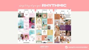
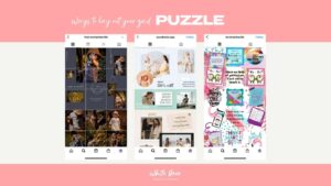
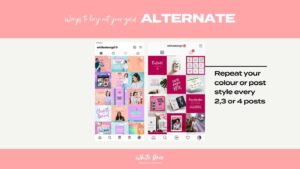
Here are the 4 ways to lay out your grid, my biggest recommendation is RHYTHMIC as it allows for fluidity, scheduling and posting on the go, while still looking professional and considered (but not overly curated!).
Sure! Here are the pros and cons of the four ways to layout your Instagram grid:
1. Alternate:
Pros:
– Creates a clean and cohesive look with alternating colors or themes.
– Provides a sense of balance and symmetry.
Cons:
– Requires careful planning and coordination to maintain the alternating pattern.
– May limit creativity and flexibility in posting content.
2. Rhythmic (Jacqui’s recommended):
Pros:
– Establishes a consistent visual rhythm and pattern.
– Can create a visually appealing flow when scrolling through the grid.
Cons:
– Can become monotonous or predictable if not executed thoughtfully.
– May require repetitive or similar content to maintain the rhythm.
3. Puzzle:
Pros:
– Engages followers and encourages them to explore the entire grid.
– Creates a unique and eye-catching visual effect.
Cons:
– Requires significant time and effort to plan and create content that fits together like puzzle pieces.
– Can be challenging to maintain consistency and balance in terms of content and design elements.
4. Random:
Pros:
– Allows for more freedom and spontaneity in posting content.
– Reflects an authentic and organic feel.
Cons:
– May lack cohesiveness and visual harmony.
– Can be confusing or disorienting for new visitors to your page.
– No clear branding or story.
It’s important to consider your brand image, content type, and target audience when choosing a layout for your Instagram grid. Ultimately, the layout should align with your overall brand strategy and help communicate your message effectively.

Which tip do you want to implement today? Remember, a followable IG feed is all about a blend of strategic design, obvious value, and clear branding.
Check out this video for a deeper dive into this topic:
If you loved this episode as much as I loved sharing it with you…there is more where that came from.
- Be sure to subscribe so you don’t miss out on future juicy design hacks. For bonus points and a little “eeeek” from me as I sit on the other end – I would LOVE if you would leave a review and rating. It’s a little thing that makes a big difference and helps me continue to produce more DIY goodness for you!