Turn your brand and graphics into a client magnet with the FREE bingable 3x video series.
Grab your freebie!
Blog Categories
Canva, branding, design, marketing and empowering women in business!
Hi, I'm Jacqui! The girl who fell in love with design and business.
Listen on Apple • Listen On Spotify
Ever wonder what it really takes to build a million-dollar brand? Or maybe you’re curious about why some brands just seem to have that “it” factor that makes them impossible to ignore. Well, you’re in the right place!
In this episode, we’re diving into the magic behind million dollar brands and what five (plus one bonus) traits they all have in common.
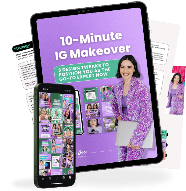
PS. Got 10 minutes? Perfect—because that’s all you need to give your IG feed a premium-level makeover! I want to give you a free guide to walk you through three insider tweaks to creating a feed that feels authentic yet polished, weaving in your brand effortlessly, and boosting your posts with pro design tricks. Head to www.whitedeer.com.au/IGmakeover and grab the ’10-Minute IG Makeover Free ‘guide—let’s turn your feed into a sales machine!
1. Move Quickly: The Power of In-House Design
In the fast-paced world of business, speed is often of the essence. The first key trait of a million-dollar brand is the ability to move quickly with its designs. Whether it’s a trending topic, a new product launch, or a flash sale, brands that can produce high-quality designs in-house have the upper hand.
Outsourcing design work can be slow and cumbersome, not to mention costly. By equipping yourself or your team with the skills to create professional-grade graphics on the go, you can stay ahead of the curve. Don’t let your great ideas falter because you couldn’t get the visuals out quickly enough!
2. Consistency is Key
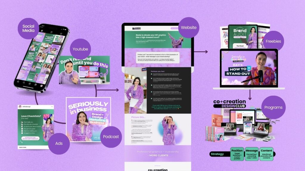
Consistency is more than just a buzzword—it’s the heartbeat of a trustworthy brand. Think about all the touchpoints a potential customer encounters: Instagram posts, Facebook ads, your website, email newsletters, and freebies. All these need to look and feel like they belong to the same business.
Not only does this approach scream “I’m legit!” but it also helps build trust and sets clear expectations. Consistent branding ensures that customers know they are in the right place when they interact with your business. For example, our brand, White Deer Graphic Design, carries the same aesthetic across every platform to offer a seamless journey from discovery to purchase.
3. Design Aligned with Your Brand Message
What does your brand say about you? Is it fun and playful, or serious and professional? The third trait is having a design that aligns perfectly with your brand message. Your visuals must represent what you stand for and speak directly to your target audience.
This alignment doesn’t happen by accident; it’s the result of strategic thinking. When you know who you serve, how you serve them, and why you do it, your brand message becomes crystal clear. And remember, these elements show up visually whether you aim to be a premium or affordable brand.
4. Margin and Space: The Professional Look
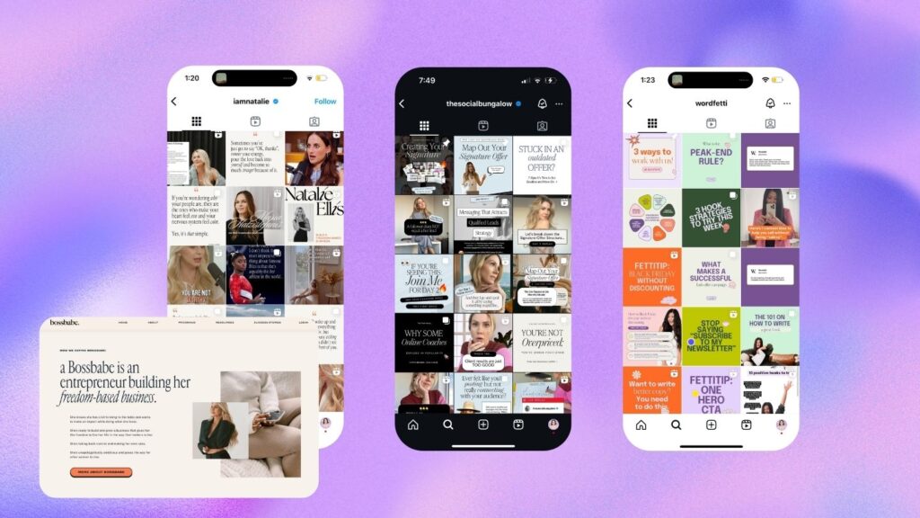
If you want your designs to look polished and premium, focus on margin and space. One of the quickest ways to elevate your graphics is by bringing elements away from the edges. White space isn’t empty space; it’s breathing room that makes your design look clean and professional.
Imagine a piece of art crammed into a tiny frame versus displayed in a spacious gallery. The latter makes a much stronger impact, right? The same goes for designs. Keep your text and visuals away from the edges to create a sleek, premium look.

5. Clear Hierarchy: A Strong, Clear Message
What’s the hook? What’s the main takeaway? These are questions your design must answer at a glance. Clear hierarchy in design ensures that your primary message stands out, and secondary information supports it effectively.
Good design isn’t about cramming every bit of information into one space; it’s about making sure the essential message catches the eye first. Use contrast in size, color, or font style to create a visual journey for your audience. This approach not only garners attention but also keeps viewers engaged.

BONUS: The Minimalist Approach: Less is More
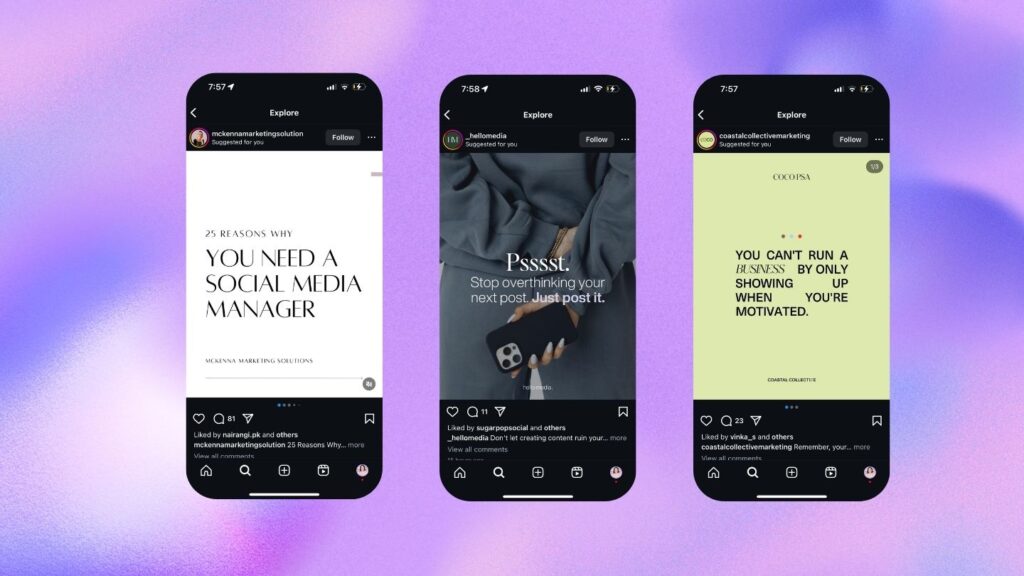
Here comes the bonus (and perhaps a bit controversial) tip: embrace minimalism. We’re not talking about stripping down to boring basics, but simplifying your designs to make them look clean and professional.
Minimal designs allow your core message to shine without unnecessary distractions. Whether it’s clean fonts, simple color schemes, or sparing use of design elements, minimalism often conveys a sense of sophistication and clarity that attracts premium clients.
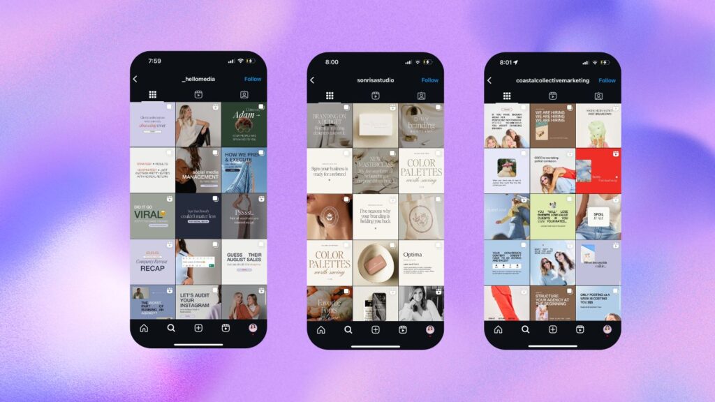
And there you have it! By adopting these traits, you’ll be well on your way to building a million-dollar brand. Move quickly, stay consistent, align your design with your brand message, use margin and space wisely, establish a clear hierarchy, and consider a minimalist approach.
Want to work with me in The Co+Creation Design Club and stop wasting you and your teams time on graphics that slow your business down? Our next intake starts soon!! https://whitedeer.com.au/designclub
If you loved this episode as much as I loved sharing it with you…there is more where that came from!
- Be sure to subscribe so you don’t miss out on future juicy design hacks. For bonus points and a little “eeeek” from me as I sit on the other end – I would LOVE if you would leave a review and rating. It’s a little thing that makes a big difference and helps me continue to produce more DIY goodness for you!