










You absolutely can create a unique, professional-looking logo in Canva. But here is the bit that matters most: Canva is only the tool. The real magic is in how you interpret your brief, choose the feeling you want to create, and make purposeful decisions under pressure.
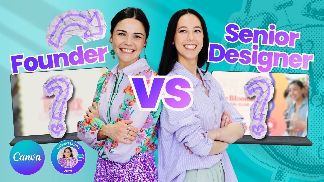
To put that to the test, we set the same fictional logo brief, the same platform, and a very tight 20-minute timer. No collaboration, no peeking, and no handy little design critique from the person sitting across the table.
Table of Contents
- Step 1: Start With a Brief That Gives You Something Real to Solve
- Step 2: Find Inspiration Before You Start Throwing Things on the Page
- Step 3: Choose One Strong Creative Direction
- Step 4: Build the Logo in Canva, Then Keep Iterating
- Step 5: Make Your Elements Feel Custom
- Step 6: Do Not Let the Clock Stop You From Making a Decision
- Step 7: Present the Design Through the Lens of the Brief
- Step 8: Define Your Brand Feel Before You Design
- Step 9: Take the Next Step With Your Brand
Step 1: Start With a Brief That Gives You Something Real to Solve
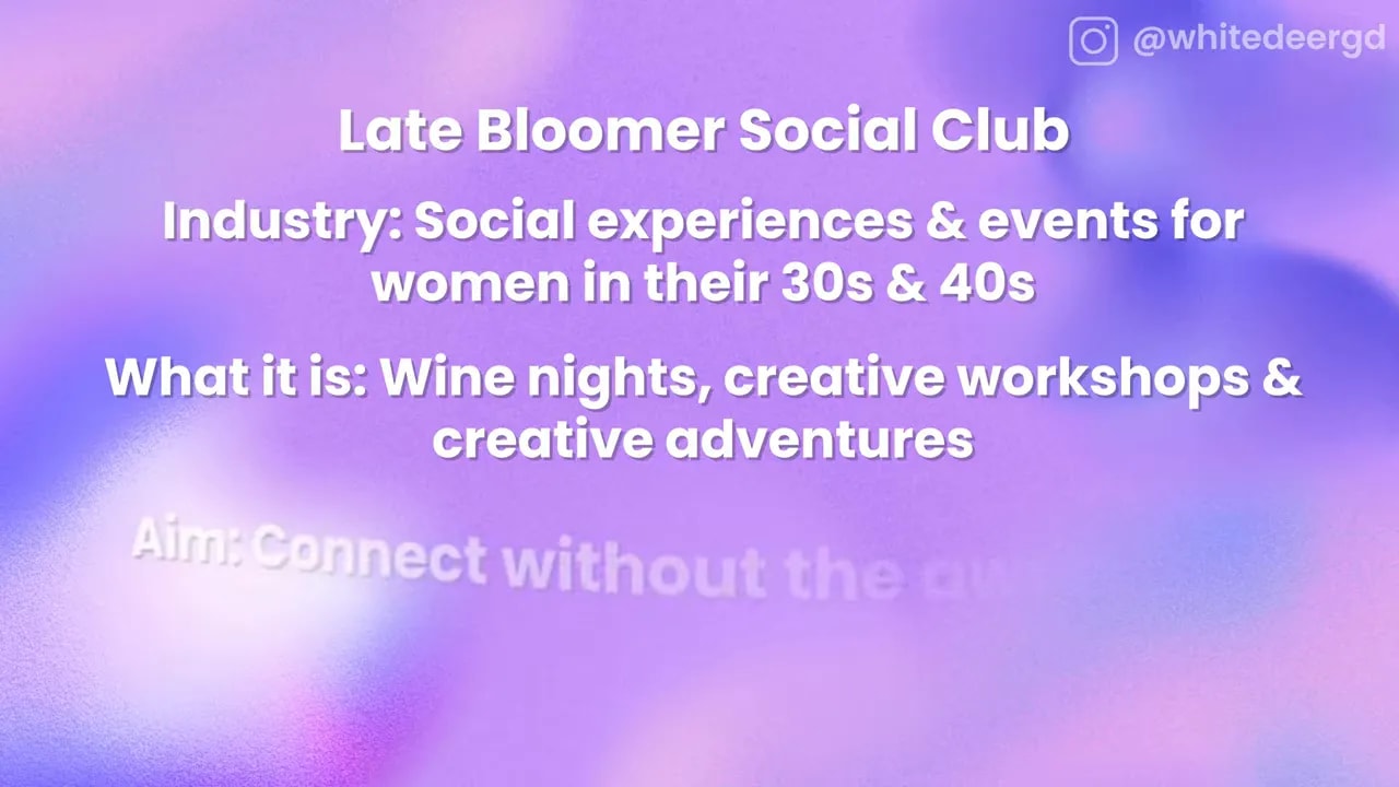
The fictional brand was called Late Bloomer Social Club, a modern social club for women in their 30s and 40s who want to make new friends without the awkwardness.
The club would host wine nights, creative workshops, and weekend adventures. At its core, it was about approachable connection for women who might feel like everybody else already has their people.
Even with a clear audience and offering, the brief left plenty of room for interpretation. That is exactly what happens in real branding. A name, audience, and list of services do not automatically tell you what a brand should look like.
You still need to decide:
- What emotion should this brand create?
- Which part of the offer deserves the strongest visual focus?
- Should it feel elevated, playful, polished, bold, relaxed, nostalgic, modern, or something else entirely?
- What would make the right person feel that this is for them?
Without those decisions, you can make something attractive, but it can be difficult to know whether it is actually right.
Step 2: Find Inspiration Before You Start Throwing Things on the Page
When you are short on time, it is very tempting to open Canva and start placing fonts and graphics immediately. Resist that urge, at least for a moment.
Start by looking for visual direction. Pinterest was the first stop for inspiration, not because you should copy what you find, but because it helps you spot visual threads. You might notice certain colour combinations, typography styles, layouts, textures, or levels of energy that keep appearing in work that feels relevant.
For Late Bloomer Social Club, the creative direction could have gone in so many directions. It could be a bold and colourful social club. It could be more refined and community-focused. It could lean into femininity, nostalgia, playful energy, connection, or the actual activities members would do together.
That is why inspiration is useful. It gives your brain some starting points before you commit to a visual path.
Step 3: Choose One Strong Creative Direction
A short design challenge does not leave room to chase every idea. You need to pick a direction and commit.
One approach was to focus on the feeling the club creates. That led to punchy, feminine colours and a fun, high-energy visual style. The design was less about illustrating wine nights or workshops literally and more about the confidence, warmth, and excitement of finding your people.
The other approach was more focused on the social club concept. It drew inspiration from the visual language of clubs and communities, then gave it a younger, more playful twist. The key motif became a Japanese anemone, chosen because it blooms later in the season. That made it a beautifully relevant symbol for a brand called Late Bloomer.
Neither direction was more correct. They simply prioritised different things in the same brief.
This is a hugely helpful lesson for your own brand. Instead of asking, “What should my brand look like?”, ask:
- What should people feel when they come across it?
- Which aspect of my business matters most to communicate first?
- What visual choices would make my ideal client feel seen?
Step 4: Build the Logo in Canva, Then Keep Iterating
Canva is brilliant for creating logos when you use it with intention. You can work with typography, colour, shapes, graphics, and layouts quickly, which is especially helpful when you are exploring a concept.
But the drafting stage is messy. That is normal. You may start with an idea that does not quite work, try a different angle, discover that an element looks completely wrong, then suddenly find the version that starts to pull together.
One very practical designer habit makes this process far less stressful: duplicate your design as you go.
When you are testing an idea, duplicate the page before making a major adjustment. That way, you do not lose a version that was actually working. It gives you freedom to experiment without the panic of having to rebuild something later.
In this challenge, the designs moved through font tests, colour exploration, decorative shapes, floral illustration work, and layout refinements. The initial colours were sometimes simply there to separate layers while the concept was being built, not because they were the final palette.
You do not need every decision to be perfect at the beginning. You just need enough momentum to make the next useful decision.
Step 5: Make Your Elements Feel Custom
One of the biggest misconceptions about Canva is that everything made in it has to look like a template. It really does not.
FREE Design Tools to $100k Masterclass
Grow your biz with clever design and Canva hacks that will save you hours and make you sales.
Customisation is what changes the result. You can combine elements in unexpected ways, alter colours, crop imagery, adjust type hierarchy, create your own compositions, and draw custom graphics directly in Canva.
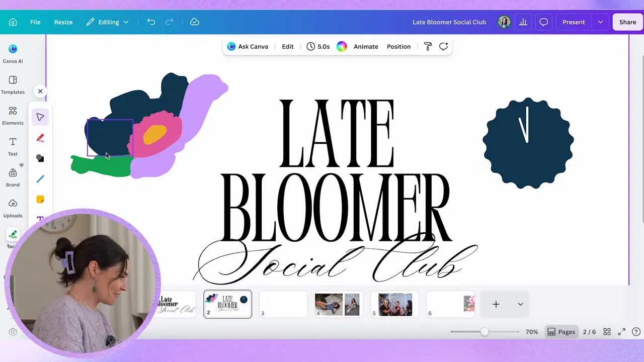
The Japanese anemone motif is a great example. Rather than relying on a ready-made flower icon, it was drawn and shaped inside Canva to create a more ownable visual element for the Late Bloomer name.
For your own logo, think beyond finding one element that looks nice. Create a combination that feels like yours:
- Pair fonts in a way that suits your brand personality.
- Use colour intentionally, not just because it is pretty.
- Create a distinctive icon, pattern, or supporting shape.
- Adjust spacing, scale, and alignment until the design feels balanced.
- Make sure your brand name remains clear and readable.
It is the thoughtful combination of those details that makes a logo feel more personal and professional.
Step 6: Do Not Let the Clock Stop You From Making a Decision
Twenty minutes is not a lot of time to create a full brand identity. It is enough time, though, to develop a solid visual direction and prove that an idea has potential.
As the timer ran down, the important thing was to stop trying to create every possible brand asset and finish one strong presentation page. A logo, colour palette, supporting visual pieces, and a simple application of the brand can tell a convincing story, even if the complete identity would need more development later.
There was one cheeky extra minute at the end, because sometimes that is just what happens when two designers are in the thick of it. But the lesson remains: constraints can help you focus.
When time is tight, prioritise:
- A clear logo or wordmark.
- A considered colour palette.
- One distinctive visual device, such as an icon, flower, shape, or pattern.
- A simple layout that shows how the pieces work together.
Do not spend your final minutes trying to make it wildly fancy. Make it clear, cohesive, and aligned with the feeling you are trying to create.
Step 7: Present the Design Through the Lens of the Brief
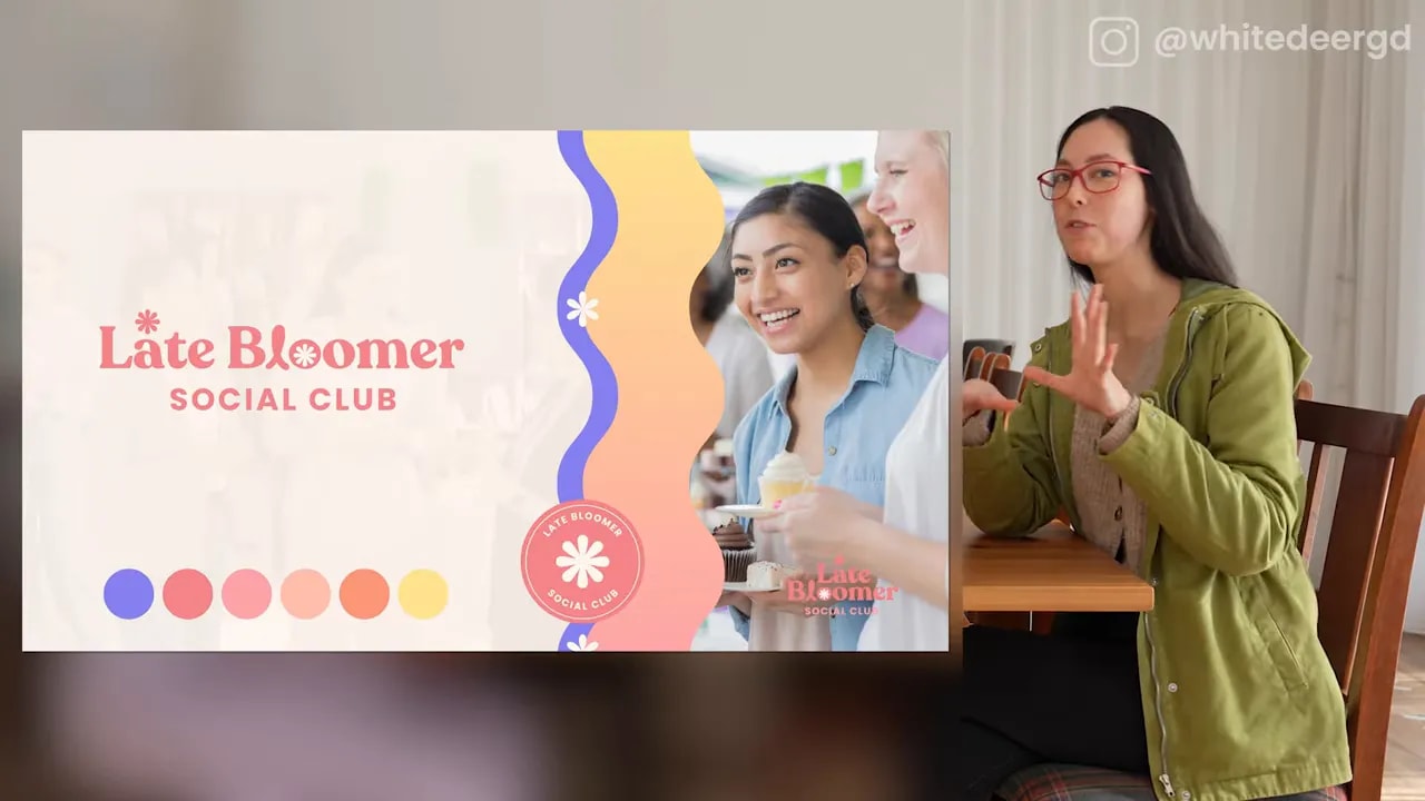
The first finished direction used bold pinks, purples, warm tones, wavy forms, and floral details. It had an energetic, feminine, punchy feel, designed around how members might feel as part of the group.
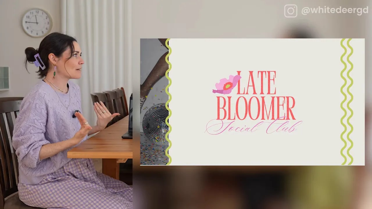
The second direction used a more club-inspired composition with a Japanese anemone motif. It leaned into the idea of being a late bloomer, combining a strong wordmark with a flower that blooms later in the season. It was playful and modern, while still drawing on the sense of belonging and community that a social club offers.
Both directions answered the same brief. Both were viable. But they told different stories.
That is why a good logo presentation is not just, “Here is the logo.” You need to explain the thinking behind it:
- What does the symbol mean?
- Why do the colours suit the audience and the intended mood?
- What brand qualities do the typography and shapes communicate?
- Which part of the brief did you intentionally prioritise?
A logo is far more powerful when every choice has a reason.
Step 8: Define Your Brand Feel Before You Design
The big takeaway is that your brand feel matters more than having a perfectly fixed idea of what you want your brand to look like.
Two capable designers can receive the same audience, name, industry, and offer, then create wildly different outcomes. That does not mean one person misunderstood the assignment. It means the brief did not specify all the emotional and strategic choices that make a brand distinct.
Before you create your own logo in Canva, write down a few words that describe the experience you want to create. For example, you might want your brand to feel:
- Warm and welcoming
- Playful and bold
- Modern and empowering
- Refined and community-oriented
- Relaxed and low-pressure
Those words become your filter. They help you decide whether a font, colour, image, or graphic belongs in the design.
Canva can absolutely help you create a unique, beautiful logo. But it works best when you arrive with a point of view. Know who you are speaking to, what you want them to feel, and which visual direction will bring that feeling to life.
Step 9: Take the Next Step With Your Brand
If you want support creating a visual brand that feels properly like you, you can work with the studio team to have your brand created for you.
If you would rather build it with creative guidance along the way, explore The Co+Creation Design Club.
And if you are ready to get hands-on with Canva, remember this: start with the feeling, choose a direction, keep duplicating, and do not be afraid to make something a little bit different.