
")


Listen on Apple • Listen On Spotify
So… you finally launched your online course. You did the whole shebang… the landing page, the promo posts, the “cart open” emails.
And then… crickets.
It sucks, right? You know your course is good. You know it can help people. But no one’s buying.
Let me gently say this: it might not be the content of your course that’s the problem.
It might be the way it looks.
I know, I know. That can feel like a surface-level thing. But stick with me, this goes deeper than just making things pretty. Because the way your course looks? It’s doing a lot more heavy lifting than you think.
Let me show you how…
People Don’t Just Buy Information… They Buy What Looks Valuable
Your course might be packed with incredible value… but if it looks like a Google Doc you whipped up at 11pm, people won’t take it seriously.
Your audience can’t see inside your course before they buy, so all they can judge is the wrapper.
The branding. The design. The feeling.
And that is what they’re buying.
They’re asking:
“Does this look like something that will actually help me?”
“Can I trust this person to deliver?”
“Is this worth the price?”
The Branding That Helped Me Sell 55 Places… On My First Launch
When I launched my very first online course, I didn’t have a big audience. No ads. No YouTube channel.
I sold 55 spots.
Yes, I had a funnel.
Yes, I had help writing a solid webinar.
But the thing that I believe really helped?
Every touchpoint, from the sales page to my Instagram and webinar slides, was on brand. It looked clean, intentional, and professional.
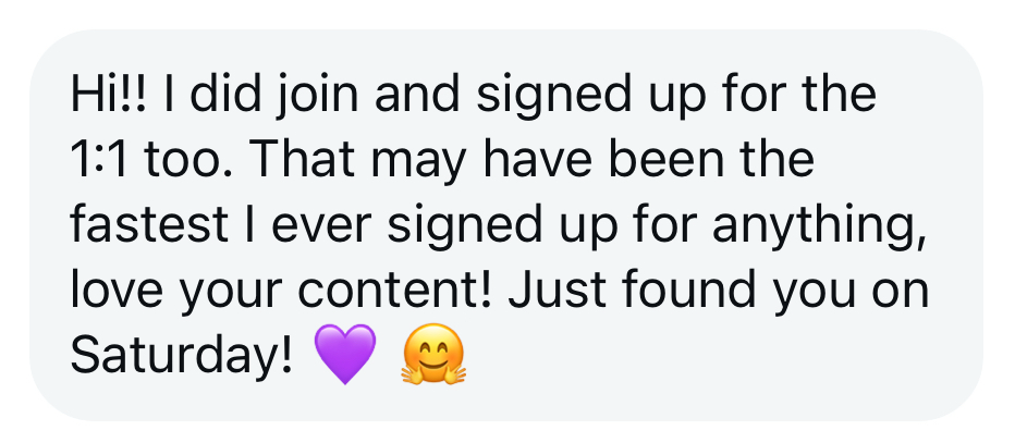
One person who signed up even messaged me saying:
“That may have been the fastest I’ve ever signed up for anything.”
THAT is the power of trust built through visuals.
If you’re more of a visual person…imagine you’re shopping for a birthday cake for your kid’s party. You come across two flyers. Both are for cake businesses. Both use the same brand colours, fonts, and even similar language.
But one is cluttered, pixelated, badly aligned, and just… messy.
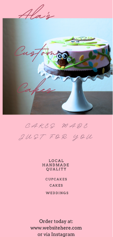
The other is beautifully designed. Crisp photos. Clean text. White space. Thoughtful layout.
Which one are you trusting with your $200 cake order?
Exactly.
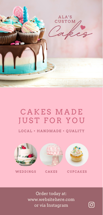
Design communicates trust, and trust turns into sales.
Your Course Is a Product… Make It Look Like One
Even if your course is “just” a collection of PDFs and videos, it’s still a product. And people expect products to look finished, polished, and cohesive.
If your course materials feel half-baked, people will wonder if your content is too.
That’s why I love using mockups.
They help your digital course feel tangible, like something they’re buying off a shelf.
- A workbook displayed on an iPad
- A video lesson shown on a laptop screen
- A podcast snippet with cute headphones
Done right, mockups show the value of your course in a glance.
Here are just some of the touchpoints to consider:
- A course logo (even if it’s just styled text)
- Colour palette and font styling
- Sales page design
- Instagram and Facebook ads
- Facebook group banners
- Thumbnails for course videos
- Email headers and banners
- Workbooks, PDFs and slides
- Course platform design (headers, portal images, etc.)
- Printed welcome gifts (yes, I do these for my Club members and they’re branded)
Done poorly, they can cheapen the whole experience (so… please don’t just slap screenshots into a phone frame and call it a day!).
When all these pieces look like they belong to the same family? Your audience feels safe. Safe to trust you. Safe to buy.
It’s not just about making your course look good. It’s about making your whole brand feel cohesive, from first click to final module.
WORK WITH JACQUI:
// DIY Design My Biz: The best course for business owners DIYing their own brand and graphics in Canva. Learn more: https://whitedeer.com.au/diy-dmb
// The Co+Creation Design Club: Design WITH the help of a professional designer in this high-touch coaching space: https://whitedeer.com.au/designclub
// Design Studio: If you’re after fully done-for-you design services my studio team can help! https://whitedeer.com.au/designstudio


